When it comes to beginner painting projects, learning how to paint a cactus is a rather simple project to pursue.
Most cactuses are comprised of circles, ovals, and cylinders. So as long as you have practiced some of these fundamental shapes you should find it relatively easy to do.
Even if you haven’t, we will do a few practice sketches anyways before we start painting. This way we can get a handle on the shapes we will need and the areas where there will be shadows or highlights.
Let’s get into it!
Gather References and Make Some Practice Sketches
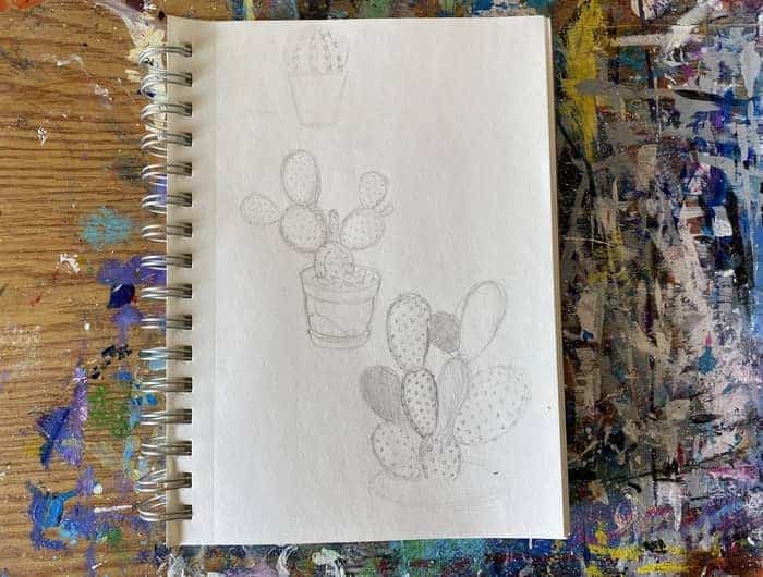
Lately, as I continue to make more step by steps like this that are on subjects I have never done before, I have found the practice of sketching out some ideas very helpful.
This is a critical step when working to create something you have never tried before and will help improve the quality of your results.
Especially if you are going to use a reference different than the one I have decided upon here.
Sketching it out will help you break it down into the shapes needed and work out any potential procedural problems.
To get started, go to Pinterest and build a board of various cactuses. Build up a mix of about half pictures that are of cactuses you find interesting and potentially doable if you decide to use it as your subject.
After that go searching for cactus paintings that you find appealing or interesting in some way and collect those too.
Then, once you have about 20 or 30 pins, choose a few reference pictures to work from and start sketching.
Start with the largest shape of the image.
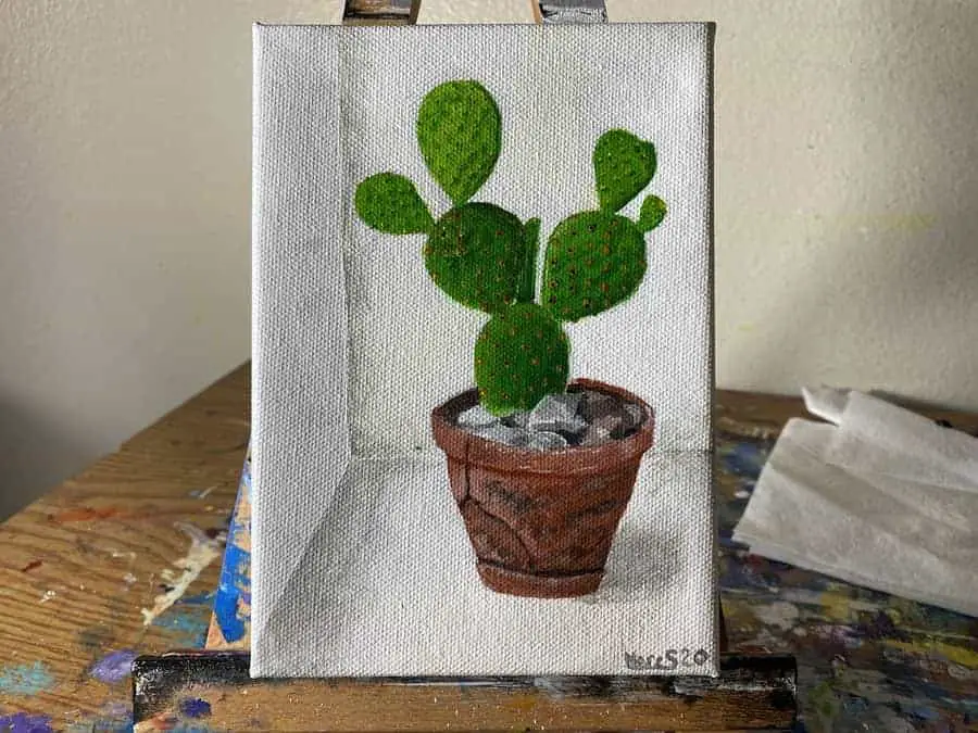
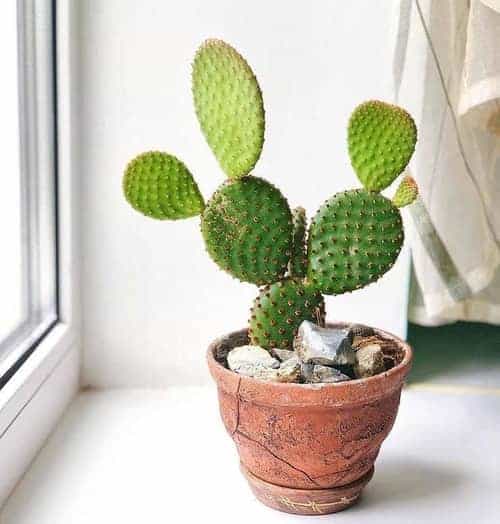
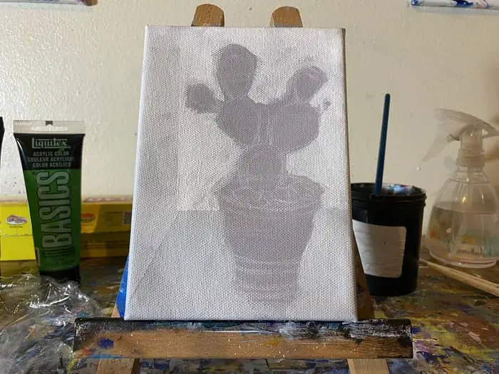
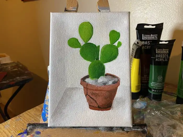
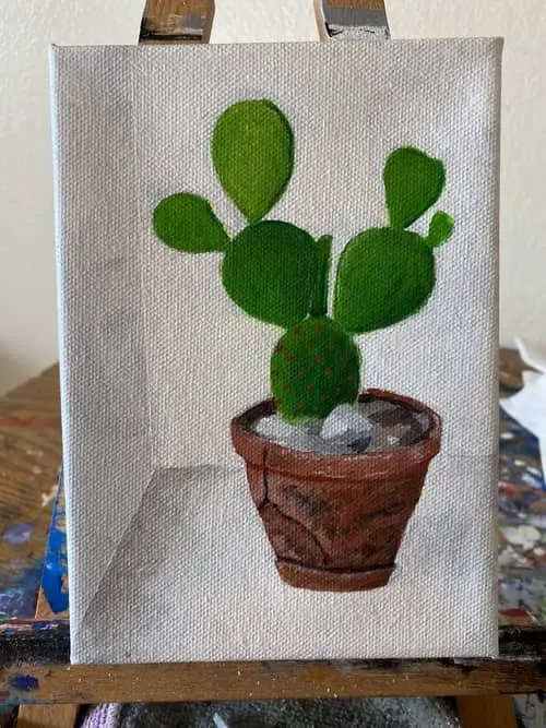
In most cases, this will likely be the pot if you are using a picture of a cactus in a pot like what I have here. This is what is called a Prickly Pear Cactus. (taken by IG profile @opuntiateam)
For my first shapes, I usually put down something very basic and very lightly drawn on the paper. Then as I get the image gradually laid out I come back and darken the lines where I get more confident they need to be.
For these sketches though I’m not trying to make things perfect. Just get a basic idea of shapes, shadows, and potential processes to use.
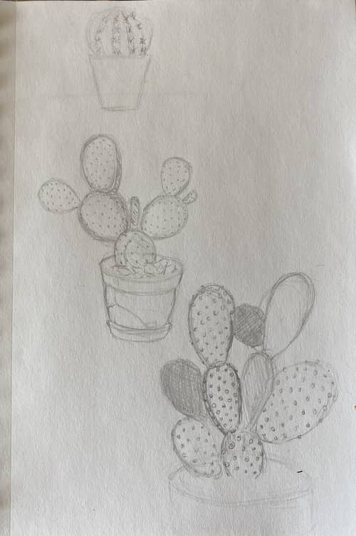
Try out different types of cactuses to see which one you would prefer to do. There are a few basic types of cactus calling for different shapes and approaches.
The Prickly Pear Cactus is the more rounded I felt the pot would add some nice character to the painting and that the circular shapes of the cactus will make it an easy project to complete.
Not too simple but not too complex. Just hard enough to be a bit challenging and just easy enough to keep us going.
Remember to hold that mindset when choosing your subject. I feel finding that right balance is key to maintaining one’s momentum and development.
That goes for anything really and not just art. It’s all about creating the right level of difficulty to get your head in a flow state.
If you can do this then you can accelerate your skill growth. It’s a very common concept understood and utilized in video game design.
Now that we have some practice sketches under the belt let’s move to sketching it out on our canvas.
Related Articles:
- How To Paint Bubbles (An Easy Acrylic Painting Project!)
- How To Paint Clouds: A Step By Step Exploration of Cloud Painting
- How To Paint Water (A Step By Step Guide)
- How To Paint a Rose Abstract Style (Easy Step by Step)
- How To Paint a Butterfly for Beginners
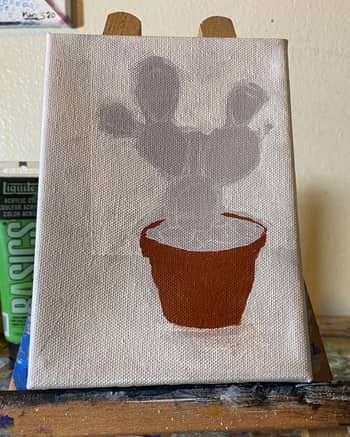
Lightly Sketch Cactus Onto Your Canvas
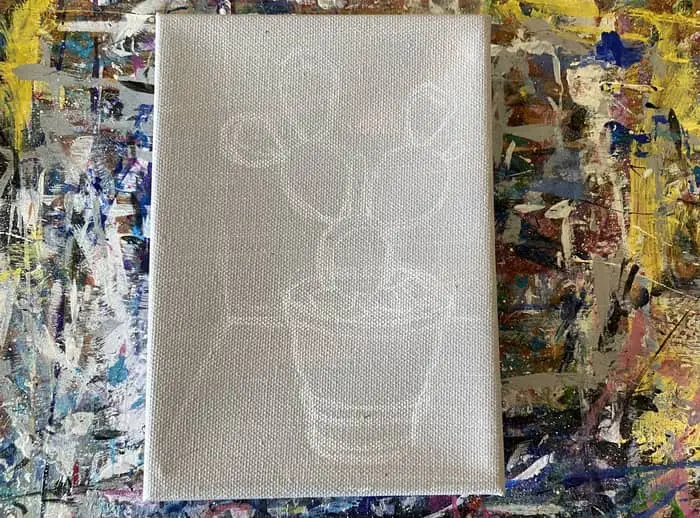
This is where we put into practice what we learned in our practice sketches.
Start with the large shapes and work your way down.
I started by placing the corner of this shot in. I’m not going for a very detailed background. The cactus is the focus today.
That said, we need to set the scene and give it somewhere to rest.
Do your best to keep this layer light. I actually tried to draw mine darker so it could be seen better but the lighter you draw the easier it is to fix mistakes if needed.
Next, add in a large cylinder to represent the pot. Then gradually shape it into the curved shape of the pot.
After that, we start building up the cactus by adding in the first oval at the top of the pot.
You may be wondering why mine is gray and white. Ya, that was a random and perhaps poor choice I made to try and tint the canvas with a bit of black tinted gesso.
Each piece of cactus on top of that is more of a balloon shape. This is one thing that makes the Prickly Pear Cactus an easy type of cactus to draw and paint.
As you add each segment of cactus make note of where the shadows and highlights are. Perhaps even draw something in to represent them so when we start painting we have a reference to work from on canvas.
I went ahead and drew in some rocks too but every little detail isn’t needed until we start getting down to the last few steps. We’re barely even started here!
Next we need to gather up some paints and decide on our colors.
Gather Up Needed Paints and Brushes
We’re almost ready to start painting. We just need to gather up the colors and brushes we think we will need to complete this painting.
Since I’m working on a smaller 5″ x 7″ gallery profile DickBlick canvas, I will mostly need to use my smaller flat headed brushes.
I will be using the 5/8″ flat headed brush for the background and sides of the canvas since it can carry more paint.
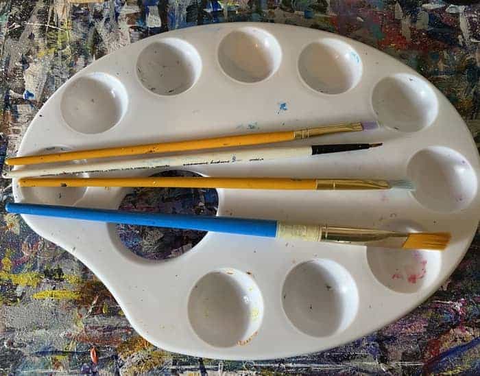
Then I will move down to the two smaller flat headed brushes as I work my way down to the smaller shapes and details.
As for the colors I have selected today, this one is on the simple side of the spectrum with a rather limited palette needed.
The colors you will need for the reference picture I am using in this example today are:
- Ivory Black
- Titanium White
- Burnt Sienna
- Red Oxide
- Hooker’s Green Hue Permanent
- Light Green Permanent
- Primary Yellow
As you can see the basic colors for this painting are green, brown, black, and white. We probably could go without the extra shades of green and brown by using our mixing skills to get those values as needed.
I happen to have them so I’m going to use them but if you for some reason don’t have all of these colors just do your best to use whatever you have that is the closest. It never hurts to practice those mixing skills either!
If you’re working from your own reference it’s a good time to practice your color selection skills AND mixing skills.
Knowing which colors to select that will mix well with each other when needed is an important skill to develop if you want to build up your ability to make whatever picture you find that inspires you.
Always look to push beyond your limits!
Paint First Layer Onto the Background
Now we finally get to the painting!
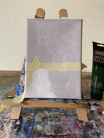
Start by painting in the background with white and gray. After drawing it in in the last step it should be relatively easy to knock out.
Using our Ivory Black, Titanium White, and our 5/8″ flat headed brush let’s start by painting in grays and whites.
Be careful when mixing your gray not to make it as dark as I let mine get. You basically want just a small dab of black mixed in with your white. Heck, with my gray colored background I likely could have gone with straight white as it would have dried a bit darker.
Most acrylic paints dry a bit transparent. Even white.
It’s just if you are painting on a white canvas already you may want some bit of color to it to see where it’s going.
In an effort to level out the lines and make sure they were sharp I used a bit of masking tape for each section.
Doing it this way will make this step take a bit longer as the paint needs to dry before you can tape off the next section but it’s useful to use for clean lines.
We will come back in later for a few more layers of paint on the background to brighten it up a bit more and add some shadows in to give it more definition.
Once you get all three walls filled in we can then move to the pot and cactus. Just do your best to paint around your cactus drawing without painting over it while you ware working on your background.
Even if you paint over parts of it you should still be able to fill in the cactus without too much trouble as long as most of the drawing remains visible.
It’s merely meant as a guide anyways.
Use a Small Flat Headed Brush To Paint In the Cactus
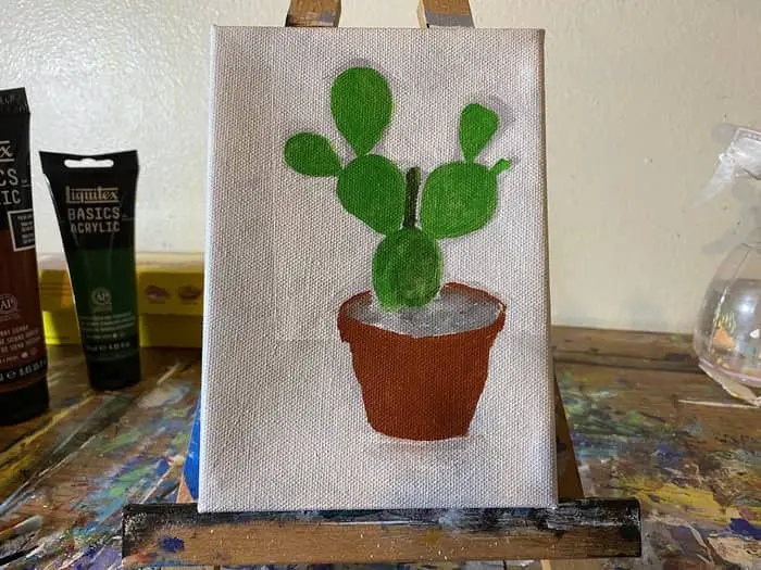
In this step we put down a base layer for our pot, cactus, and rocks.
I used a rather small flat headed brush that doesn’t have a size number on it so I’m not too sure what the measurement is. If you scroll back up to where the picture of the brushes is, it’s the small one at the top of the picture.
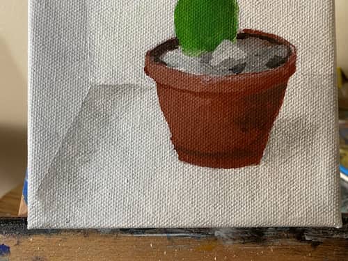
Beginning with red oxide for the flower pot, start at the bottom and worked your way up.
The red oxide is far more opaque than I was expecting it would be. Making the pot look too saturated. I also lost a bit of the curvature on the outer edges of the flower pot and some of the other details on the pot as well.
The good news is we plan to add more of the texture, shape, and details on the pot in the next few steps.
This way we can make it look a bit more aged and dirty. Ultimately reducing the level of saturation we currently have. Plus we want to add that cool crack into it too. That will be one of the last steps.
When I got to the rocks I very haphazardly painted in gray, white, and black but it ended up turning into a blurry mess. This is certainly a feature that will require more definition in the following steps too.
Really all of these layers so far are just the base layers for us to build on top of. So that goes for the cactus segments we are about to do as well.
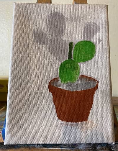
Later we will add the shadows, highlights, and variations in color that make it look more like a cactus.
For now, just start filling in the cactus segments with light green permanent until you get the whole cactus built up.
Get everything filled in and make sure the whole canvas is covered with a base layer of paint. We want to do our best to make sure there aren’t any parts of the canvas sill showing through.
That is a mistake I made in this step. The first thing I had to do on the next step was work on painting the background in to the edge of the cactus.
With a few more layers to go, we should get anything missed in this step. Especially as we start to build more details into the image.
It’s all about breaking it down into small do able pieces. Putting it together one shape at a time. Reverse engineering what your eyes and brain are seeing and then putting that down on the canvas.
Add Color Variations For Depth and Texture
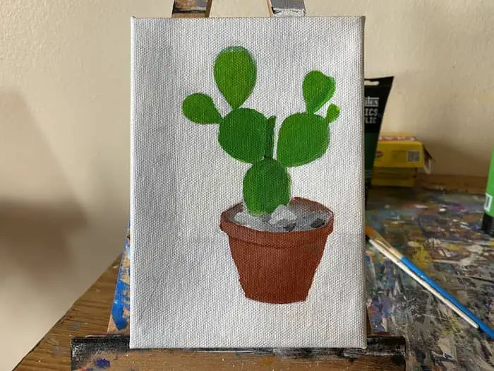
In this step, first start by working on the background again. Make sure it is totally filled in all the way up to the cactus and pout.
Then we will be looking to add more depth to the painting by working on our shading and colors.
In an effort to reduce the saturation of the flower pot I mixed a little bit of titanium white into my red oxide to create a lighter less saturated value.
Using this mixture, start at the left side of the pot since that is where the light is hitting everything that side of the pot will be brighter. As you paint, bring your strokes around the curvature of the pot to make it look volumetric.
It also helps to imagine the volume of this object. Imagine holding it in your hands and feeling the curvature. The smoothness or roughness of its surface.
One thing to note is that when you paint a lighter color on top of a darker color like this it can make it easier to create certain effects. As an example, if you look at the top of the flower pot there is a slight overhang around the rim of the pot.
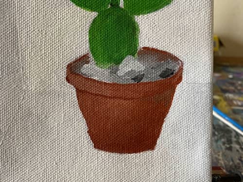
To create this, all you need to do is paint your lighter color on top of this section leaving a tiny dark strip underneath. This will create the perception that the pot has depth and a bit of lip around the rim.
This is a technique I have begun to use whenever I need a small dark strip like that. We will use it again in the next step to get some of the smaller strips of shadows that illustrate the thickness of the cactus segments.
After we work on the background and flower pot a bit add a few rocks into the top of the pot too. We painted a base layer of gray earlier, now we need to start hashing out some of the surfaces reflecting that light.
This shouldn’t be all that difficult. You want a bright gray, or a white tinted with a tiny bit of black, to create that light-reflecting surface with a flat headed brush.
Its’ basically a one stroke maneuver with a small flat headed brush.
I also added in some black spots too for some of the shadows we are seeing in the picture.
Add More Highlights, Shadows, and Texture
Okay, now we are getting to the fun part of the painting where it all starts to come together.
In this step we are looking to start building up some of the smaller details.
First, lets start by adding some shading and shadows in. Since the light is coming in from the left side all of our shadows and shady parts will be mostly on the right side.
With the exception of some things like the dark shadow running around the base that the pot is sitting in or the shadows in the rocks.
Start with the shadow on the right side of the pot by mixing a tiny bit of black into your red oxide. You may want to add a bit of white too to help mute the color a bit.
We’re still working on desaturating the colors on the pot Compared to our reference picture it is still too saturated.
Then very carefully and lightly begin to add it onto the pot. Remember to keep your strokes moving with the curvature of the pot to get that volumetric feel to it.
Whenever I want to add something gradually I usually will add a drop of water to my paint to water it down a bit. This way it dries a bit more transparently than normal and I can build up my confidence that I’m headed in the right direction.
This is a good way to get some of these light shadows we are adding in and then when you have confidence you have things right add the darker features to sharpen the details further.
Both of these techniques I just referenced, moving your strokes with the curvature of the surface and going light until you build confidence, are both techniques taught in the fundamentals of drawing course by Brent Evinston available here on skillshare!
While they are obviously drawing techniques, learning to draw will certainly enhance one’s painting skills.
Once you have some shadows laid out on the right side of the pot mix a very light gray to create a shadow on the surface next to the pot. You will also want to use the same technique I mentioned before where you thin your pigment out a bit with a drop of water.
We want to add a shadow to the corner where the surface meets the left wall as well. This will help add a bit of depth and dimension to the scene.
At this point in the painting, every little bit we add helps to achieve this effect.
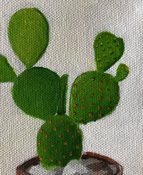
Next, let’s work on the cactus a bit. Here is where I realized I needed to grab some primary yellow to help give the cactus the lighter shade of green it has in some areas.
We’re basically trying to add depth and dimension by add dark green to areas that are a bit more shadowy and yellow green to the areas that are getting hit by more light.
Since I forgot to take pictures of what I was doing here I created this illustration to try and better show where my attention was focused.
The dark red lines represent my darkest shade of green. They are also where we can visually see the thickness of each prickly pear segment.
The duller red is meant to represent where the shade is somewhere in between our darkest green and lightest yellow green colors. A gradient transition for the most part.
Then of course the yellow represents where you will want to use the light yellow green we have mixed on our palette.
The last thing we need to do in this step is add the crack to the pot and a bit more of the texture.
For the crack once again start by lightly adding it in with a bit of watered down paint for transparency and easy of flow. Once you feel like you have the placement correct darken up that crack further with another pass.
This time with less water in the paint. You sill want a tiny bit to help get that thin dark line we want more easily otherwise it doesn’t flow off the brush so well.
You can also add little bits of white mixed with red oxide to the rim of the pot too.
Paint In the Prickly Part By Adding Layers of Dots

Now, there is much more going down in this last step than the main headline reveals.
Most of the focus will be on the dots on the cactus where there is likely some prickly pointy things. You can’t really see anything prickly from the picture but there must be some reason it is called Prickly Pear Cactus!
Plus…it’s a friggen cactus right?!?
Anyways, before we get to that, I spent a bit more time working on the flower post. Ultimately, it still feels flat to me. I don’t think I fully captured the volumetric feel of the shape towards the bottom half of the pot.
I kept working and reworking it but eventually decided I needed to move on. That’s just an indication I have some work to do on volumetric shapes.
Then there is the shading and textures on the surface of the pot. It bothered me I couldn’t get the texture of the pot quite like what it looks like.
Eventually we just have to move on despite whatever dissatisfaction we might feel. Then do our best to remember that experience and figure out new projects that will challenge that boundary.
Moving on to the prickly part of our cactus, due to the size of my canvas, these need to be created by putting down small dots of paint.
I started with the bottom segment of the cactus and tried a light brown first. The good part is the dots go across the cactus in a steady geometric pattern.
While they are tedious to build up you should be able to get a decent result by examining the pattern in the reference and attempting to do something similar.
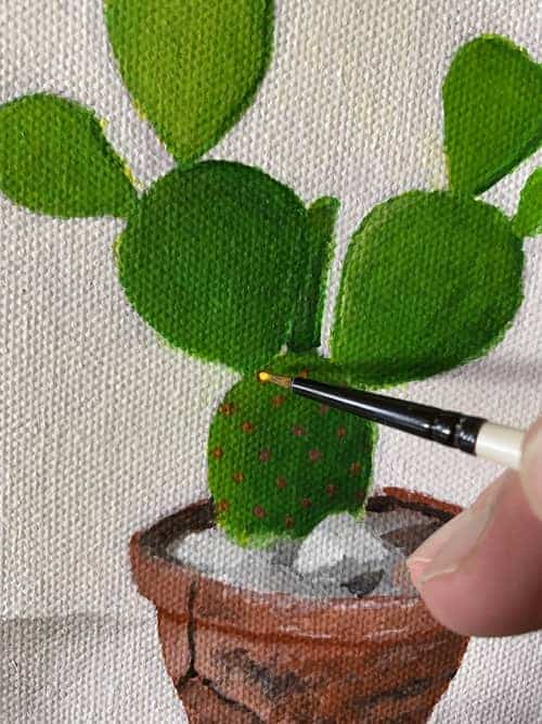
I experimented with a few different approaches. Here you can see me coming back in with primary yellow and attempting to add a highlight to each dot where you can see the light hitting the hollow centers.
When I got to the next segment of cactus I tried a darker brown towards the right side that has less light and a lighter brown towards the left side that is more lit up.
First I attempted just to add yellow but it wasn’t really visible. So then I tried to add a dark green shadow to help give the effect there was some feature or bump on the skin of the cactus.
With each new segment, I had to try different colors to get the right effect. Some of the smaller pieces towards the top right had points on it that were a bit brighter than what I could accurately represent with my current level of skills.
Then while it was still wet came in with a dot of yellow on the left side to try and simulate where the light was hitting this feature of the cactus.
If you are following along with this step by step just be sure to take your time. When you find yourself beginning to half ass it or getting sloppy, it’s time to take a break.
Come back with fresh eyes and keep adding layers.
Once I had all my dots of prickly things painted I then came back in with a dark green to try and add some shadowy curvature to each point on the lighter segments of cactus.
Using a very small bit of paint on my brush and then dragging the pigment out in the needed curvatures to create the desired effect. Sometimes you need to dry the brush once you put your dot of paint down if your brush is too wet.
This cactus painting turned out to be a bit more challenging than I was expecting and left me with the realization that I really need to work on practicing my volumetric sketching to get a better handle on how to make things look three dimensional.
Did you make it this far? What did you learn by attempting to paint a cactus?
If you want to share your work with me I’d love to see and hear from you on Instagram! You can find and follow my account here if you’d like to keep up to date with everything I’m working on!
