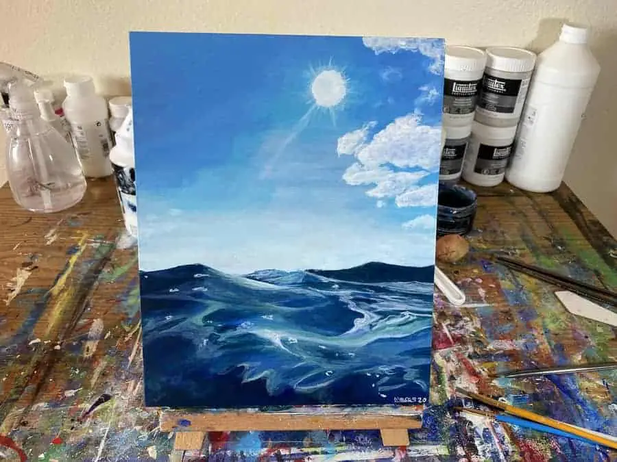
Water makes for a very interesting paint subject. It’s many different states can make it a challenge.
So with that in mind I want to create a series of step by steps anyone can follow along with. This way if you are totally lost on where to begin you have some way to get your bearings and get started.
This is just the first of several to come to this site.
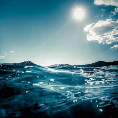
For today’s painting we will be using this reference photo I found on Pinterest. This photo was originally posted on Flickr by a profile named Cuba Gallery.
I couldn’t find any further details on who the actual photographer is that took this picture though.
Feel free to use whatever reference photo you want if you don’t like this one. The process should be relatively the same.
Before we can get started we will want to decide on what colors we think we will need to get close to what we see here.
I’m going to go with:
- Ultramarine Blue
- Light Blue Permanent
- Titanium White
- Light Green Permanent
I don’t think I will need very much green but it looks like just a tiny bit may help to get the desired color.
Often times once I get going other colors make their way on to the palette as needed.
For my brushes, I’ll likely use some small square-headed brushes. Whenever I start a painting I do my best to make an educated guess on the tools I may use.
Just like with colors sometime other brushes find their way into the mix as needed.
This particular painting is the first one I am doing on a wood panel. If you are using wood for yours as well be sure to properly prep it. If you’re not sure how to do that check out this page I wrote on “How To Use Acrylic Paint on Wood” by clicking here!
To be honest though I didn’t even follow my own advice on that page. Mostly because I wanted to experiment. Since I don’t have too much experience painting on wood yet I have to try different things to see what happens.
I would encourage you to adopt an experimenter’s mindset too! Don’t be afraid to try things and make mistakes!
Just don’t make the same mistake I made on this one. In prepping the wood I used two layers of clear gesso. I had a lot of trouble getting the paint to spread like I am used to and it quickly would get absorbed into the wood.
For proper preparation, if you are only going to be using gesso, I would recommend at least four to six layers before you start painting. With some sanding between each layer and after the last one.
If you want to take it the extra mile check out the page i linked before. There are additional tips to be found there.
Related Articles:
- How To Use Acrylic Paint On Wood: Prepping to Paint
- What Can You Use Acrylic Paint On? 13 Surfaces To Paint On!
- Wood For Acrylic Painting: The Products You’re Looking For
- How To Paint a Sunset in 8 Easy Steps (Beginner Acrylic Painting)
- How to Paint A City Skyline (Textured and Abstract Style!)
Start By Painting Your Background
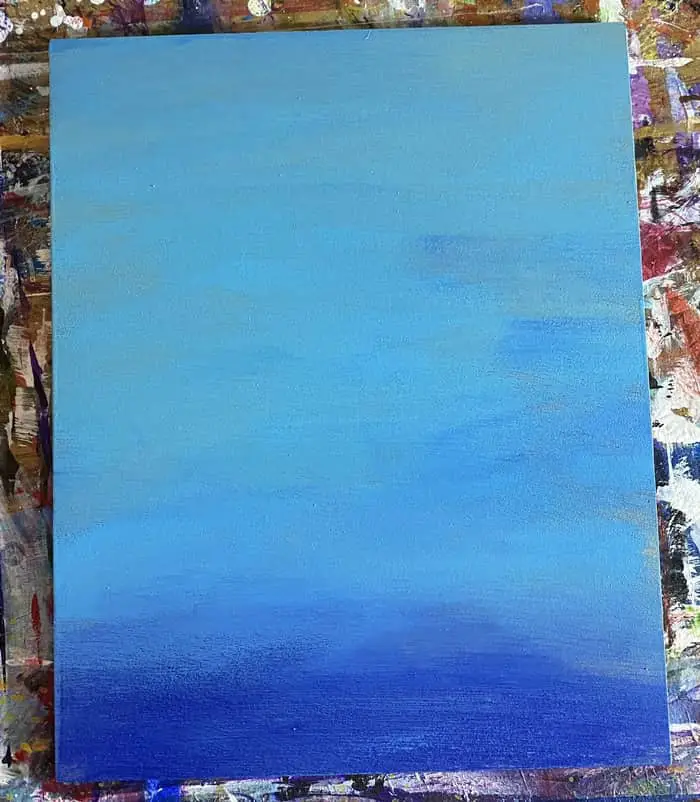
For me, this painting started off as just an experiment in painting on wood. At this point in this painting, I didn’t know what I was going to be painting yet.
Since you know what you are going to be painting you want to start by putting in the basic areas of your painting.
Going for a simple gradient between the lighter and darker portions of your painting is always a great place to start. In this case between your sky portion and your water.
It helps to get a general idea of where things will be on your painting surface. When drawing or painting it is always best to start with your largest shapes or areas of color and then work your way down to the smallest.
When painting in particular, a loose representation is totally fine. We can always paint over it and add more where needed.
This is what I end up doing in step 3. In fact, avoid making my mistake by being sure to paint the bright white glow into your background for the sun and the glow of the misty clouds right off the top of the waves.
As long as you do that in this step you can avoid some back tracking. Since this was my first piece on a wooden panel that I prepped poorly it took some effort to correct this mistake.
Add Your Horizon, Wave Shapes, and Sky Gradient
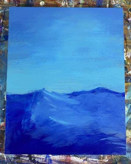
In this step you want to define a bit more of your important areas. It’s okay if it is still a little bit messy.
We will tighten up the details as we go.
For me, this was when I figured out I wanted to do the reference photo at the top of the page. So I filled in a nice dark blue block for the water area.
Then I started to darken the sky a bit. Doing this on a wood surface is slightly different than a canvas but you want to do this lightly to get that blending effect.
We want to leave a spot for our sun.
As previously mentioned, I really should have brightened things up a bit before adding the waves too.
In the next step, I will need to paint over the waves a bit to get that white misty glow effect we see coming off of them in the reference picture. Hopefully, you have already headed my advice and avoided making the same mistake.
Regularly, when working on canvas, adding a bit of water to your paint to increase its transparency and then lightly dry brushing it on would be good to get this glow on canvas. If I had properly prepared my wood paneling to be more smooth and less absorbent then it likely would work the same on a wood surface too.
Since I didn’t do this correctly it was a bit of a different technique to get it how I wanted it.
Add Your Sun and Clouds
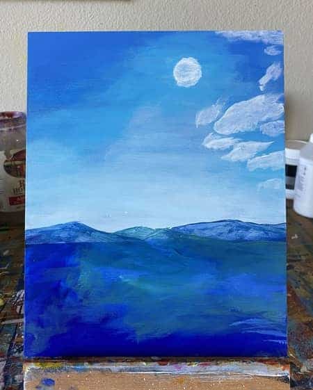
By the time you get to this step you should be able to focus on adding some spots for the sun and clouds.
Since I made a number of mistakes already when it comes to making my painting look like my reference photo I had to go back and fix the background to brighten it up a bit.
As long as you didn’t make this mistake you should be able to add some spots for the sun and clouds pretty easily.
I used a small square headed brush to do this. Normally on canvas my cloud making technique works better. I usually alternate between the brush that has the paint and a dry brush to fluff out the clouds and make them look soft.
It works pretty good on canvas.
Right now this painting looks like a mess but pretty much every painting I do hits this phase at some point. We have to keep going to get it where we want it.
Especially when there are some glaring mistakes to fix early on.
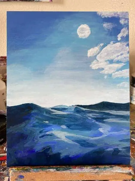
Define the Darker vs the Lighter Areas of Water
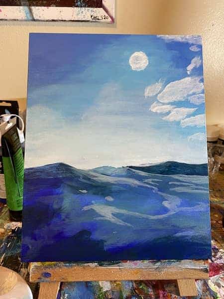
In this step, we want to start adding more variations of light and dark blues to our water. Along with a bit of green mixed into our blue as well.
We are basically just trying to define the darker areas vs the lighter more reflective areas of the surface of the water. I’m looking for large shapes in each to carve out.
For this stage, it may help to actually squint a bit when looking at the reference photo to blur some of the details and see a bit more clearly where the dark and light shades are.
If you squint just a bit at this picture you’ll see this red line I’ve drawn outlines what I am referring to.
What you’re looking for is the division I have defined in this example.
You basically now want to put down another layer to better match the overall colors of these areas of water.
In the following steps, we will continue to build on this in order to better define our waves. Just keep this picture in your mind though as we will continue to carve it up like this into smaller and smaller pieces. It’s all about shapes and variations in color!
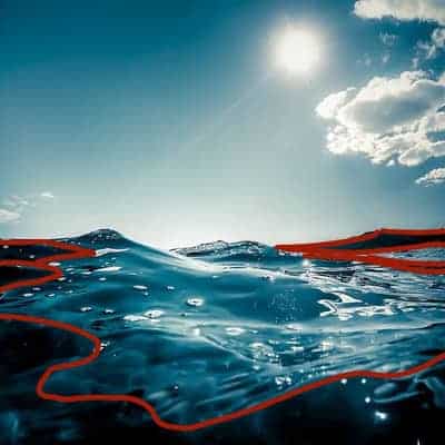
Look For Shapes To Carve Out More Details
For this step we want to continue building up on our previous layers by carving out more of the shapes we see in the water.
We basically use the same process as in the previous step but looking at the next level down. In all the steps up until now, we were working pretty loosely and broadly.
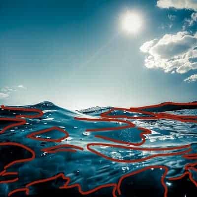
In this step and the next few steps, we will start to tighten things up a bit as we progress down to the finer details.
As you can see from this example here, we’re looking to break this up into smaller areas.
These red lines illustrate some of the divisions I see between different colors.
Allowing me to create a variance in my colors to better show how the light is shining through and off of the water.
In the process of drawing the red lines on our reference picture I noticed some spots I missed or need to go over better on the next layer.
If you have the means to do something similar it may help you develop your painting as well.
I have Procreate on my iPad so I just opened up the picture in that to create this example picture but now that I’ve seen how it can help me catch things in my paintings I may start doing that more.
Continue Painting In Smaller and Smaller Shapes
For this step, we continue to work our way into smaller and smaller shapes.
Add more depth in some of the areas where you see you might have missed in the previous steps. Create different shades of dark blue and just look for the shapes that color makes in the waves.
Creating more folds, reflections, and depth into the waves one small shape at a time.
For my demonstration painting, I needed to try to get a smoother blend between the different shades of blue. In doing so the blue under the clouds was a slightly different color so I had to paint over some of the clouds to try and get the background color on the right side to match what is on the left.
I then added the clouds back in a bit more carefully this time. I used plain titanium white for this. Painting on wood certainly takes some getting used to but it’s not so bad once one gets the hang of it.
If you have any issues in areas of your painting like this that are bothering you now is the time to start trying to fix them up.
After working on the clouds, I moved on to adding a bit more to the sun.
I attempted to get some of that glowing glare effect we see in the reference picture. On a normal canvas, I would just mix a bit of water in with my paint to give it a more transparent effect.
On a wood panel, this technique doesn’t work as well but it is still the only way I know to get anywhere close to this effect. We will just keep working on it for the next couple of steps until we get it how we want it.
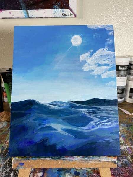
Add Light Blue Green Highlights
In this step I attempted to give my water a brighter light blue green tint.
Focus on the lighter areas of color where the light is making the water glow a bit.
Keep looking for shapes you can fill out in the this light blue green shade of color.
Be careful to either mix enough of the color you will be using or do your best to get the same color if you need to mix more. I made the mistake of needing to mix it again and my second light blue green mix did not match the first one.
This is one mistake I made that I feel has caused things to get a bit muddier in this step than I would like them to be. I want the next layer to be the last step for this painting.
I’m definitely going to be doing more projects on how to paint water soon. Only next time it will be on a regular canvas!
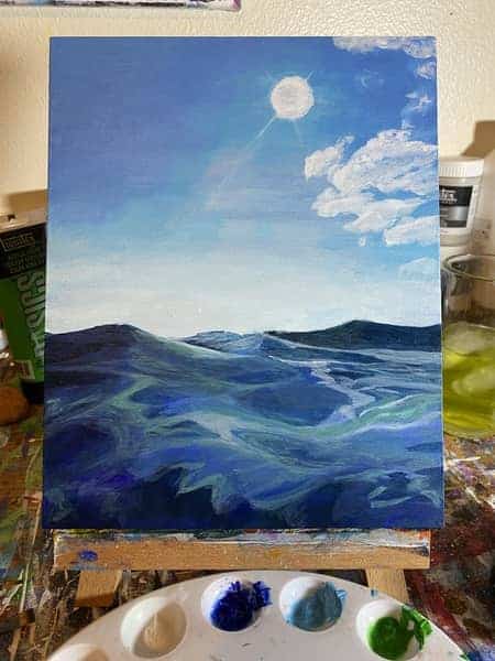
Add Reflective Highlights and Surface Bubbles
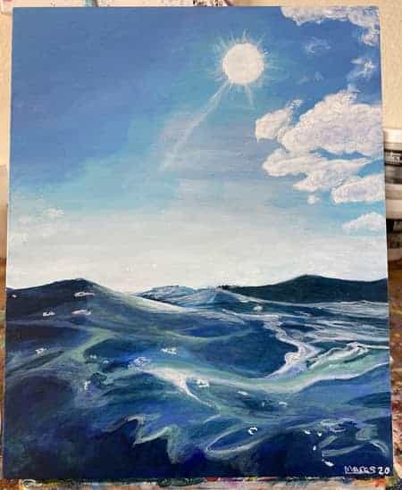
Okay, Now we bring it home. To put our finishing touches on it we’re going to add our brightest reflective highlights.
Before we get to that though see if there are any spots or areas you might want to darken up.
For me, in that last step I brightened things up too much to get that green tint to the water that I wanted. So the first thing I did in this step was create a dark blue green to go over a few of the parts that needed some attention.
Just touching up parts here and there to bring back that depth needed in certain parts of the waves.
So if you have any areas you need to darken up now is the time to do it. Just continue to break down your reference picture in the shapes that we have been looking for to determine what you need to add.
Then, once we are satisfied with the depth we have created, we move on to the reflective highlights.
Mix just a tiny bit of light blue paint with your titanium white to get a very slight blue tint to it.
This is when to start using the two smallest brushes you have. I used a small number 4 square headed brush and spotter. As long as you have something close to these that’s fine.
Use the small square headed brush with the light blue tinted white mix to create the reflective parts of the waves we see.
This particular brush is good for getting really thin lines. Square brushes are always good for this.
I did find by this point some of my normal canvas techniques started working and becoming necessary as well.
Often when the paint I apply looks too bright I will dip my brush in my water, then push the water off the brush on the side of the palette, once you do this you can then start to spread out the spot you applied that looks to bright.
This can be an effective way to erase a mistake you make as well if you are quick enough.
You can also mix a small drop of water into your paint before you apply it to help it spread a bit further and ensure it dries more transparently while creating the highlighted effect you want.
These techniques take some trial and error but if you give them a shot you will get an idea of how to use them.
Once you get some of the curves and sharper details of the waves take the other smaller brush, the spotter, and use it to create the little bubbles floating on the surface of the water.
After that make any necessary additions to the sun and clouds you might need. Add the slight corona glow to the sun using the previously described techniques.
Then add the highlights to the edges of the clouds. Just make small circles and wort your way into the cloud as the pigments on your brush thin.
I had to add a bit of dark blue to some of the areas of my clouds to give them that slight shadowy look we see in the picture. Then I painted over that with my white blue tinted paint to get it where I wanted it.
By this point you should be feeling like your painting is finished! If you have anything you aren’t happy with just do your best to make minor adjustments to it until you get it where you want it.
A lot of getting good at art is trial and error. As you can tell by this post and my many frustrations with it being my first painting on a wood panel.
I hope you learned something from my mishaps in this project! If you gave this project a try and want to show me your work you can always reach me on Instagram!
I’d love to hear from you and see your work!
