No lies, I’m a geek for space. One of my first paintings was a galaxy painting. One of my first posts was “How To Paint a Galaxy” which you can check out here.
While I have had the moon in some of the paintings I have done I have not done a painting where the moon itself was the subject.
Let’s do one together! For this painting,we will be using our moon but when it comes to moon art there are a lot of options to go with.
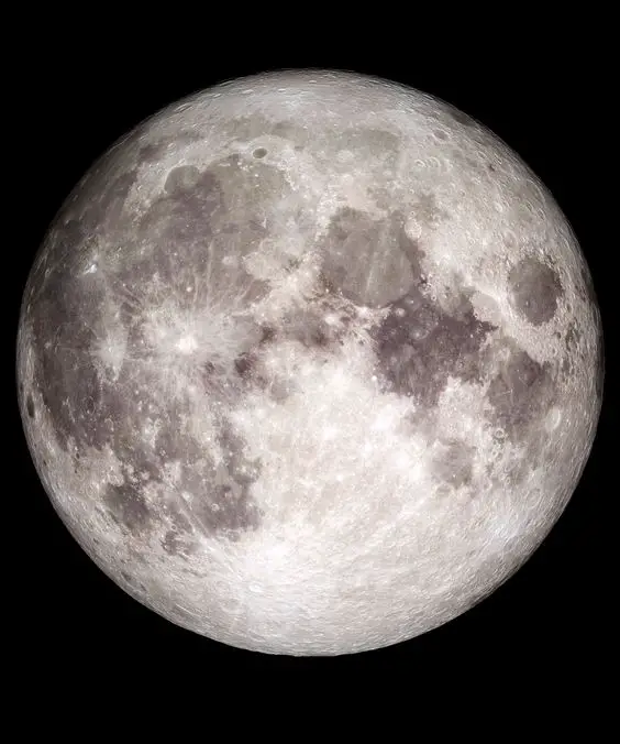
For this particular project, I want it straight on suspended in space. No stars in the background. Just the moon floating all alone in the darkness.
This picture originated from NASA but if you go on Pinterest and search for pictures of moons you will find many other options you can choose from as well.
Half moons, quarter moons, pretty much whatever phase of the moon you might want. You could even do all of the stages in one painting.
If you’re looking for more of a challenge than what this reference presents feel free to find your own reference to use.
I’m a fan of keeping my challenges simple enough to inspire action yet hard enough that it will push me to reach for it. That’s a good sweet spot to shoot for.
If it’s too hard it will be discouraging.
The Paints and Brushes You Need
For this painting, I will be using only Ivory Black and Titanium White. Any type of black and white should do whether it’s Ivory Black or Mars Black.
I’m not familiar with any type of white other than titanium white though…
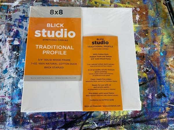
I will be using a nice square 8 by 8 inch from DickBlick. They’re a great place to stock up on supplies from. I’ve been getting my supplies from them pretty much since I found them.
Check out their selection on their site!
A square canvas is pretty good for this one considering the reference photo and the subject.
As for my brushes. I’ll be using a large square edged brush to cover my larger areas.
This will be the black on the background and whatever shade of white gray I end up mixing for the moon.
We could use a sponge for some of the inner parts and blending. We could use a smaller square headed brush and a dry brush.
There is the wet on wet blending technique that might come in handy.
It all depends on what techniques we choose to go with. After watching so many artists I know there are a ton of ways to approach any project.
I’ll cover the techniques I end up using as we go as well as the alternative options so you can decide which to try.
Paint Your Canvas Black
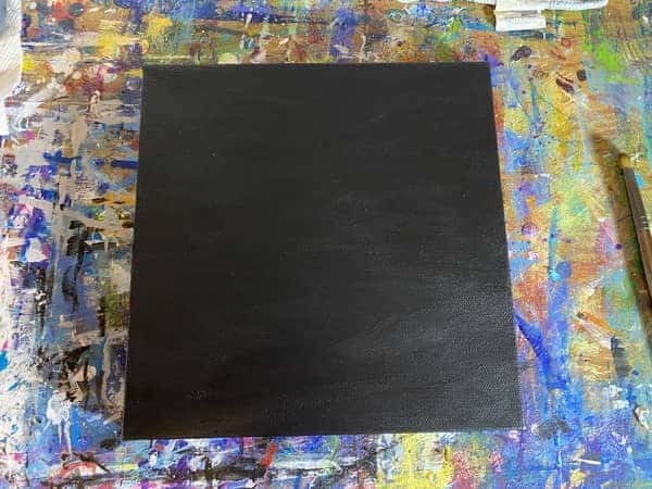
The first step for this painting is to paint your canvas black. This is a standard step for most space paintings I do.
It is kind of a no brainer and goes without saying considering the reference picture.
It may take more than one layer. I had to do two to get it to what you see there.
I suppose if you want to take some artistic liberties with it you could try to create a glow effect around the moon. I’ve seen this done in other tutorials but that is generally something that is needed for a moon being viewed through the atmosphere.
For this viewing experience, we are in the depths of space. Approaching the moon in its isolation. We are explorers seeking to plant our flag.
I’m going to place mine in the center and make it rather large so I can get all the details on the surface and the sense that we are approaching it.
I also want to leave enough empty space around it to make it feel desolate and alone.
Thinking about things like this is a recent development in my art process and the only reason I mention it is so you can follow along with me in my thinking about some of the artistic liberties one has at their disposal.
Considering things like composition, placement of the subject, placement of certain eye catching details, all of these considerations begin seep their way into your process.
Something like this makes it easy though as it’s basically a large circle taking up all of the main intersections of the thirds of the canvas.
Let’s actually look more at this in the next step.
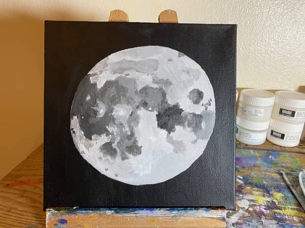
Paint In a Circle for Your Moon Using a White Gray
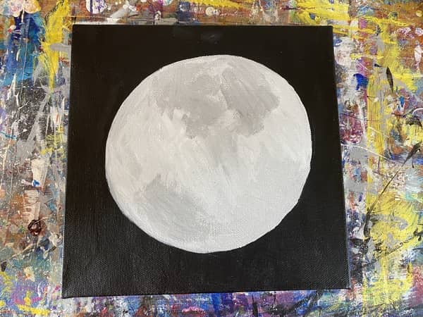
For this step we want to start with our largest shape of the entire picture. We obviously need a large circle so let’s start by painting one in.
There are several options to achieve this.
I just started painting mine on. I was going to freehand a circle out with a white colored pencil but decided against it. Instead, I did it with my paintbrush.
One thing I did actually do to prepare was try out size and placement in Procreate.
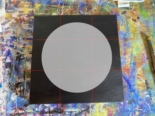
I also wanted to create a quick image to show you the rule of thirds in action so you can start thinking about composition too. This is probably something you are already familiar with as most phones have it built into their camera function.
The light red lines you see in this picture were my attempt to show you but I forgot to make them opaque again before I exported it. Whoops! My baaad.
I think you get the general idea though.
Once I had it laid out in Procreate it built my confidence to put it to the canvas. I think I got pretty close to what I digitally brainstormed.
This is just one way you can approach it!
Another option that I saw in some tutorials was to trace an outline around something large and round. Then paint that in.
This will help ensure a nice round circle. It should be pretty easy to paint it in once you have an outline down.
The other thing I saw as well was stencils or stickers.
As we saw in our “How To Paint Bubbles” step by step, which you can find here, the artist of Chloe Art on YouTube has these circular masking stickers she uses. I have no clue where she gets these but these are another great option if you can find them.
I personally love using masking tape for things like this so if I ever figure it I certainly will be adding some to my collection of tools.
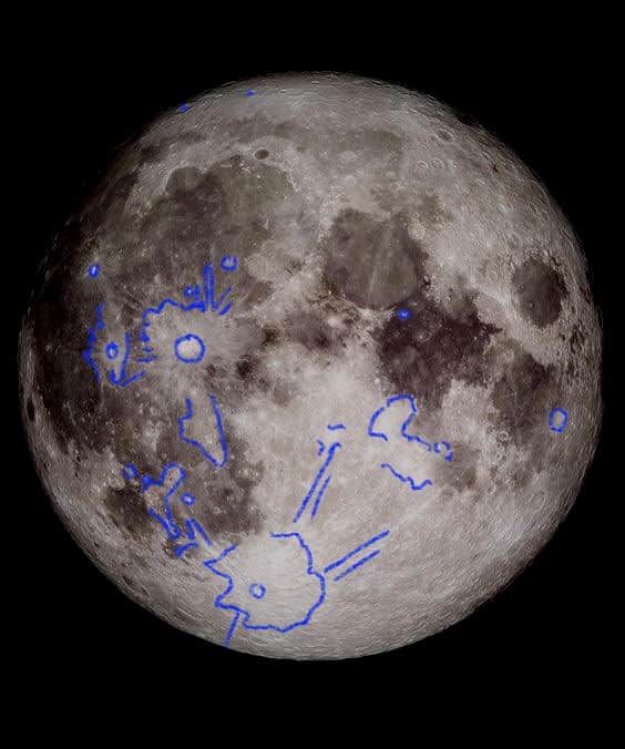
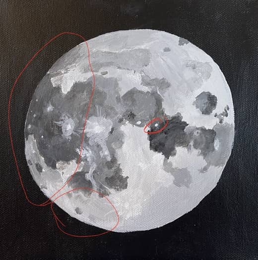
Paint in the Largest Dark Areas of The Moon
Working our way down from the largest shape of the circle, what are our next largest shapes to carve out?
To me, it’s the dark areas of the moon.
When it comes to painting or drawing anything it’s all about looking for simple shapes. As well as working your way from the largest shape down to the smallest shape.
So when I’m looking for the next step down from the circle I’m looking for the largest dark shapes I can lay out.
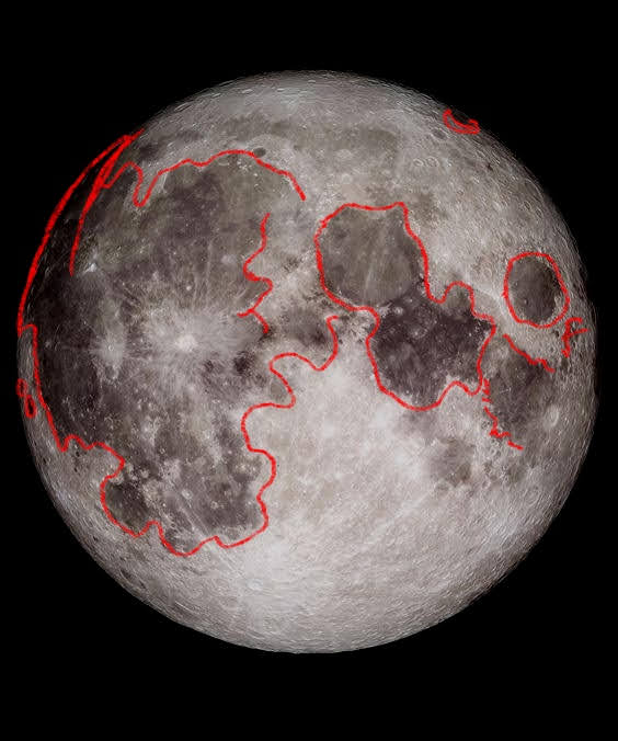
As you can see from the red outlines in this picture the dark splotches are what I am focused on.
Fun fact: These dark patches are known as maria, meaning seas, and are comprised of basalt. The good news is basalt happens to be a staple of a lot of construction materials. Let’s start building that moon base!
Before we get to building that base we should probably finish this painting.
If you think drawing it in before you start painting will help you then I recommend doing that. You can also practice by sketching the moon. I actually have done many sketched of the moon in the past year.
None quite like this but still enough. Plus it seems these little outlines in Procreate I’ve been making to show you what I’m doing is helping me as well.
While this is something I have generally done in my head until now it seems to be helping refine the skill.
So if you have the means to carve up your reference picture digitally you may find it accelerates your development. The more senses you are able to engage in something the more you will level it up.
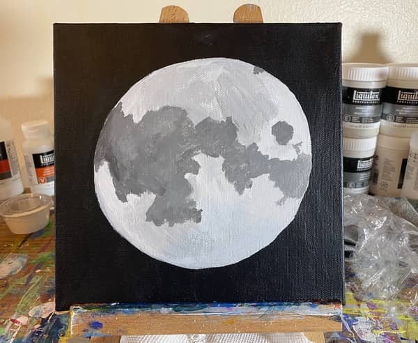
Paint Smaller Dark Spots and Start Blending Areas
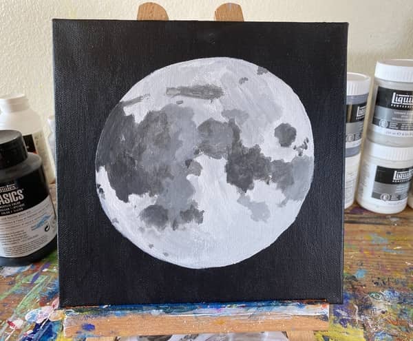
For this step, we are going to be looking to fill in some of the smaller dark spots and start adjusting the shading in some of the areas to get smoother blends.
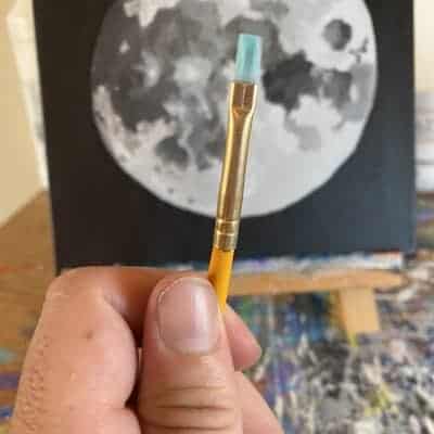
For most of this step and the last step I used a number 6 flat brush. As I got down to some of the smaller parts of this step and some of the areas I wanted to blend better I would alternate to number 4 flat brush.
Quite a bit smaller but it will definitely help to get some of the smaller details correctly as well as when it comes to blending smooth gradients.
One thing I do when working wet on wet is apply the darker paint with one brush and the lighter paint with the other brush. Using the brush with the lighter paint I’ll blend them together to get a smoother transition between the two.
This is important for this step as we need to blend some of the dark splotches of the moon into lighter areas.
As we have done in previous steps we need to continue trying to identify smaller and smaller shapes.
Not just shapes but details too.
To help me focus on the right parts I once again went to procreate to lay out a plan of action. Again we are looking for distinct shapes we can add to our image to help give it more character and definition.
This time though it’s a little more challenging as we aren’t just looking for shapes but areas of color that need to be blended better.
They either need to be made darker or lighter and into some sort of gradient.
I outlined some of the shapes where we want to focus our attention. The shapes that have straight lines are the areas that we need to start trying to get a better blend on.
While this is the basic game plan for this step feel free to touch up whatever areas call to you while you’re painting. Sometimes when you see a detail you have to attack it right away.
It’s going to get a lot harder in the next steps as we try to shape and sculpt some of the finer details.
Related Articles:
- Easy Galaxy Painting For Beginners
- Painting Planets With Acrylics
- How To Paint A Galaxy (Easy Step By Step Guide)
- How To Paint Clouds: A Step By Step Exploration Of Cloud Painting
- How To Paint a Rose Abstract Style (Easy Step by Step)
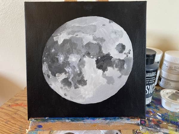
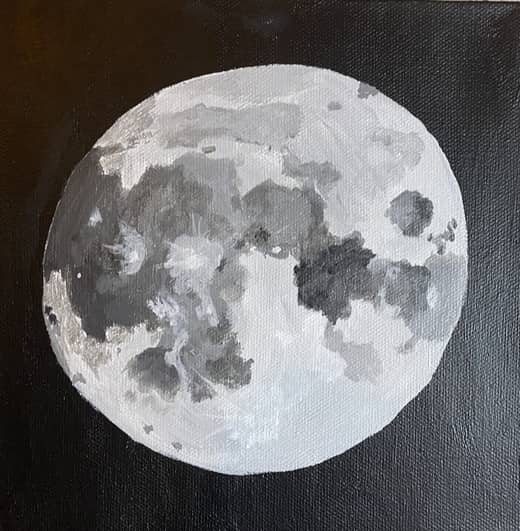
Start Painting the Lightest Areas In
Here we start honing in on some of the finer details.
We’re looking go add more shades of gray that are on the lighter end of the spectrum.
We’re looking for the areas that are around the same sizes of what we did in the last step where it’s a lighter gray or in some cases white.
Here is another example of what it was I was looking at.
The craters and areas outlines are mostly light gray or white.
In fact, since we are focused primarily on craters of this nature so it got me wondering what’s the deal with the white craters?
It turns out these are technically the “newest” craters. Which is basically anything in the last BILLION years.
Anyways , in order to get the effect of a crater impact I used the straight edge of my brush and pulled out quickly. You want to make sure your paint is slightly watered down and then only load a tiny bet at the tip of your brush.
It’s a bit challenging to get right. I messed up a few times and had to paint over some of the bad ones. Don’t forget that is always an option if you do something you don’t like.
One of the benefits of working in all these shades of gray is they are pretty easy to work with over each other.
Just keep filling out the shapes where you identify them. Do your best to compare one shape to the other to determine the best size and placement of each one.
Add Smaller Details and Make Adjustments
At this point, it is becoming a bit more difficult to outline all the little changes I’m making but I will do my best!
The biggest changes in this one are the large dark spot near the top of the moon. It was too dark so I tried to make it a bit lighter and blend it better.
So look for areas of your painting where you may have got the shade of gray a bit too dark and attempt to adjust it to match the reference.
There were a number of white spots I still needed to add all over the moon. Some you can see as they stand out in the dark splotches but others are a bit more difficult to see unless you lean in close.
For the darkest spot in the middle right side of the moon I added more tiny dark spots in an attempt to make it look more like the picture. It still needs some better blending and some tiny white spots.
To the right of that area I attempted to soften the blend to make it more gradually shift from dark to light back to dark again.
If you’ve made it this far just take your time and knock out one small detail at a time. Between details be sure to take a step back and view the picture as a whole.
Sometimes when focused so intently on one tiny thing you may be forgetting to compare it to the larger picture. Other times being honed in on the minute details like that without worrying about the larger picture will allow the larger picture to come into focus.
It’s all about balance and transitioning back and forth between the minute details and their place in the larger picture.
A little better blending here, a tiny crater there that only barely differs in grayscale.
You obviously want to use a much smaller brush as well. Personally, I’ve been using a number 4 craftsmart flat headed brush as pictured here.
At times I should have switched to a smaller brush but it worked for most of this step. In the next step we should find a smaller brush to use as we will be trying to add more visible indents and craters on the north and south sided of the moon.
Another area I added to was on the left side of the moon. For this area I made a shade of gray between the darkest blotch on the left side of the moon and the lighter areas both north and south of it.
I wanted to be careful with this as this is going to help make the moon look a bit more spherical. Once I had the right shade of gray mixed I dipped the brush in the water and then wiped it off to make it damp and help water down the paint ever so slightly.
Then I rubbed the brush on a clear area of the palette to ensure there was very little pigment on it and that it was watery enough. Then I began to carefully and lightly add it both above and below the darkest spot on the left side of the moon.
This ultimately didn’t dry so great but that’s okay! We still have a few more layers to go to fix it.
There are still more areas that need better blending and minor adjusting as well.
We just have to add another layer or two and I think we can wrap it up and move on to the next one!
Keep Adding Small Details and Blending Areas As Needed
I suppose we are working our way across various sections of the moon when it comes to adding the smaller details in.
While I try not to get stuck on any one area for too long it’s easy to slip into tunnel vision.
First and foremost we had to fix that blending on the left side of the moon. If you look at the picture below you’ll see it was a bit cracked and didn’t have a smooth gradient towards the southern end of it.
While I was working on that I ended up painting over the two dark spots to move them and try to make them more…crater-like? If that makes sense.
The size and spacing of each was off so when I accidentally painted over one it was…how does Bob Ross say it? “A happy accident.”?
I’m paraphrasing of course but it was just one of those things that you just have to roll with and next thing you know you have something that is better than it was before.
It’s a bit harder to point out some of the other areas of correction just by talking about so to help you see the differences better I made this side by side.
The areas that are outlined in red are where the vast majority of the changes took place.
Now you can compare the two areas to see for yourself some of the smaller things that were changed that I’m not describing correctly.
There are some dark spots closer to the south pole that I repainted and a number of white craters I added as well.
This basically what you want to do at this point. Keep narrowing it down and honing in on the minutia.
In the next step we are going to finish it out.
Add More Details To Any Neglected Areas and Sign
In this last step we’re going to bring it home. For this step we want to add our finishing touches.
There were a few areas that still needed a better gradient. Most specifically the dark blotch of gray all the way on the right side of the moon should have a lighter gradient going out to the edge of the moon.
Next I worked on the south eastern quadrant of the moon just sound of the gray spot on the right side of the moon.
This area has very light white features that are very difficult to see so just basically try to add some white highlights and details to this area. This will give it a sense of terrain instead of leaving it a flat gray.
Next, in this step I finally figured out the secret to making really good craters.
This whole time I have noticed how the vast majority of the dark craters had a white rim to them.
At first I was painting these tiny gray dots and trying to paint a little thin line of white around them. While this worked it was messy and not nearly as good as this next technique.
The secret it so put a dot of white paint down first. Then while it is still what put a dot of darker gray paint in the middle of it.
Once you fill out your dot with the gray paint, especially if you do it while it is still wet, it ends up leaving the perfect little white rim around the crater.
This makes it look a lot more like the craters we see in the original picture.
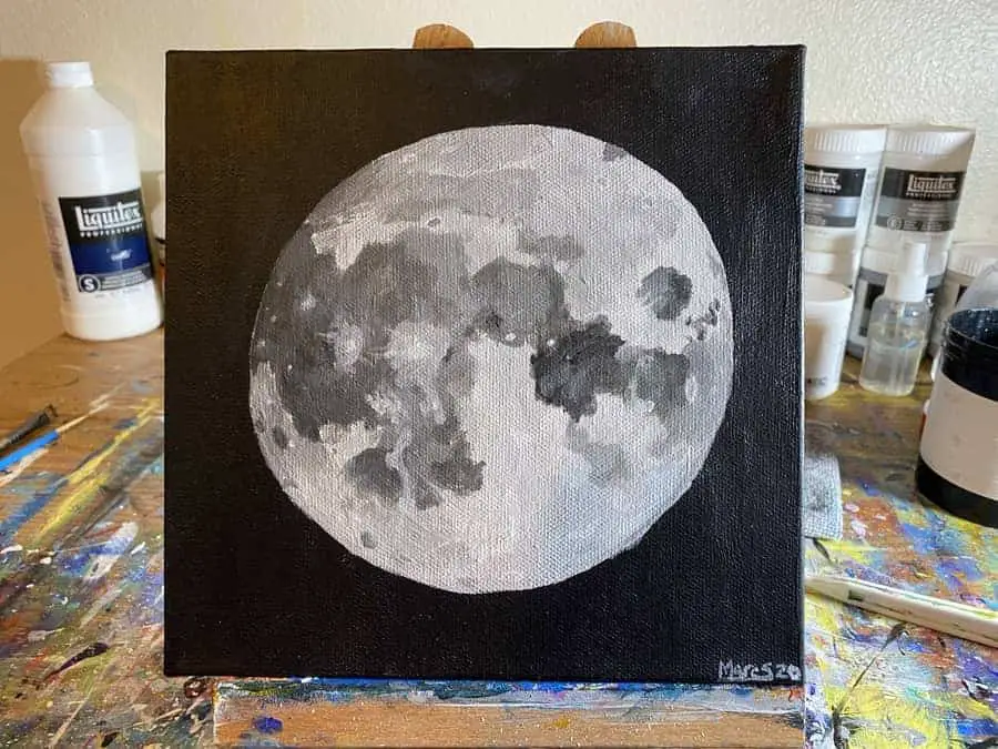
Now for the final comparison! Let’s see how close we got to matching the original picture!
Not too shabby if I do say so myself. That’s one small step for man but one giant leap in artistry!
Corny jokes aside, this painting was an excellent challenge in proper blending techniques and how to hone in on the smallest of details.
For me, I also learned the secret to making good craters and how to better illustrate what I’m doing to break down these images into smaller shapes.
I think I will continue to try and build on this so I can better show you how I am getting these sorts of results. That way you can give it a try yourself.
There is only so far the descriptive word will get me when explaining.
I’ll soon be producing YouTube videos as well to accommodate these step by step tutorials.
If you found this helpful and want to stay up to date with everything going on in the Art With Marc studio my Instagram account is the behind the scenes place to be.
It’s basically the first stop of all of my content in the content production pipeline. Follow me on my Instagram account here and be sure to check out the site for more helpful tips and techniques!
