I’ve wanted to try painting a campfire ever since I painted a candle. That candle was a rather small painting that still took some time due to the challenge of getting the glow effect.
There is something about a light piercing the darkness and causing everything to glow that is entrancing to me.
Let’s practice illuminating the darkness together in this one by learning how to paint a campfire this time!
Before we get started working on our campfire we need to do some prep work. I want to change things up a bit in this one and push my process a bit further than normal.
Not just push it further, elaborate more for you on my entire process. So let’s start with the true beginning of my current painting process.
Gather Your References and Study Your Subject
One thing I do that I don’t often talk about enough is to study how other artists paint or draw this particular subject matter. In this case a campfire.
I very often will read and watch all the useful content on someone painting something first. This is both because I’m attempting to create content to compete with them but also to see the various different ways people approach it.
Once I get to a point where I’m ready to get going I then go to Pinterest to gather potential reference pictures. I usually look for both paintings and actual pics of what it is I want to paint.
Up until now, the paintings have been mostly for style ideas while the pictures are potential references. This time though, I’m going to use some paintings for references too.
A while back I watched a YouTube video by Lucas Pienador where he talks about how to use multiple references to create something new and unique.
I have yet to take his advice on that. I feel I’m now getting to a point where I should challenge myself to take it to the next level by using multiple references this time.
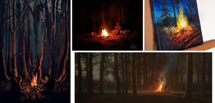
The collage of paintings above will be the paintings I am trying to draw elements from. You can use the same ones or if you’d like or take some time now to find 3 to 4 pictures you want to use as references for this painting.
If you’re not comfortable trying to draw elements from 4 different sources feel free to follow along with just one if you’d like.
Another tactic I try to abide by whenever possible, in a lot of cases it’s not, is to take my own reference pictures. I obviously didn’t do that for this project.
I mean, I could have. I do have a lighter…
Perhaps if I had a backyard with a fire pit…
Hey! Maybe if you have access to one you could try using your own picture!
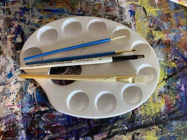
Gather Your Supplies
Now that we have our references we need to setup and start painting.
Since my main reference picture is mostly black with shades of brown, and orange that is what I will be using for my palette.
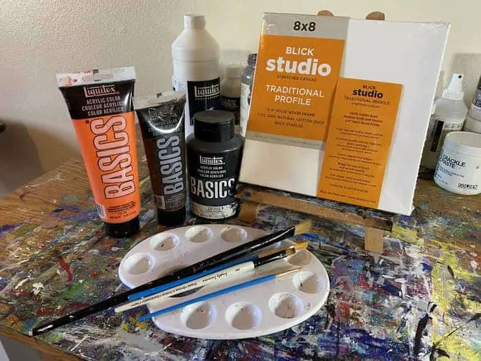
I’ve got an 8″ x 8″ traditional profile canvas from DickBlick and all Liquitex paints.
To be more specific about my paints I have:
- Ivory Black
- Burnt Umber
- Cadmium Orange Hue
Sometimes once I get going other paints find their way into the mix as needed but lately I’ve been experimenting with limited palettes.
Lately, I have been watching a bit of the artist Slew over on YouTube and he talks a lot about how he loves working with limited palettes. The last few paintings I have done (“How To Paint a Moon” and “How To Paint Clouds”) naturally called for limited palettes.
In the moon painting, I only used black and white. So I’ll probably try to stick to just these 3 colors.
If you’re using a different reference picture just do your best to choose the colors you think you will need. Learning to choose the right colors and learning to mix colors is a part of the journey.
Paint Your Background Black and Brown
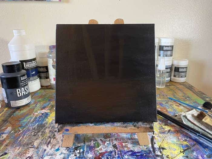
If you’re following along with me, what we want to do now is lay down our background.
While this is the first step it actually takes a few layers to get the canvas completely covered.
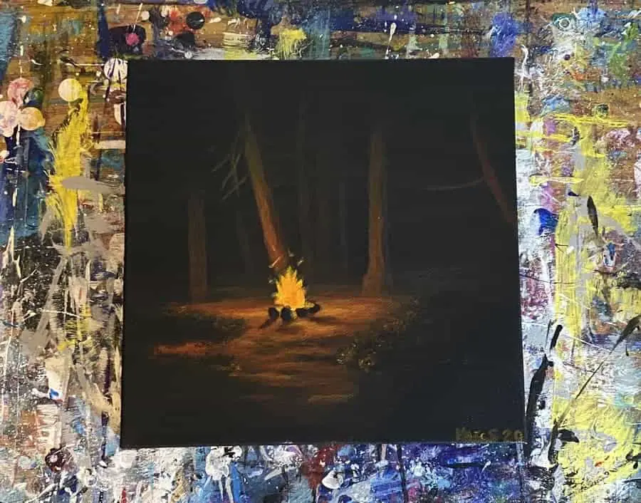
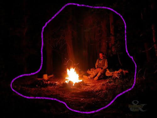
Since our reference picture is so dark we’re going to make our background almost all black with a bit of brown in the center area where the ground is illuminated by the fire.
It took me about 3 layers of paint to really get the canvas covered completely. The blend of brown I have in the center isn’t entirely how I wanted it but it will do for now.
I was trying to just lay the foundation for the area outlined here in this picture. Putting down some dark brown for the ground and some of the trees.
If you happen to be using different reference images we’re just trying to lay down some base colors to build on top of. Something to help us get an idea of where everything will ultimately go.
In most cases, we’re starting with our darkest colors and moving towards the lightest.
Lately, I’ve been wondering if I should start trying to draw my paintings before putting paint to canvas. It seems to be a common practice many artists do and I have been questioning if I’m building a bad habit by not doing it.
I seem to make this approach work but you have to be vigilant on questioning whether or not there might be a better way. You must constantly be looking for ways to improve.
Okay, enough preaching, moving on!
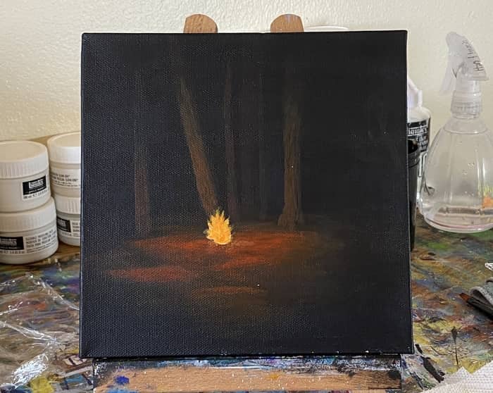
We now have a basic background with a little placement of our visual focus beginning. Don’t forget to start adding some trees in too!
Keep it light and thin. This is just a beginning placement. Since we don’t have a drawing guiding us and all. Plus it will help in the next steps as we add the fire and glow effects.
Paint the Fire and Start Adding the Glow Effect
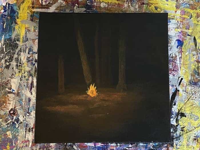
Now that we have some resemblance of land and trees emerging from the darkness we need to light this baby up!
To start with, try to get a color mixture as close to your fire as possible and paint the fire in.
For this painting, since it’s so dark and the fire is so distant from our viewpoint, it’s not just about the fire but the way the glow of the fire illuminates the darkness.
It’s one reason I chose some of the paintings for references.
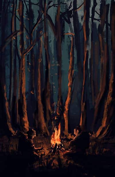
Take this painting by Kaelakov on Deviantart.
There are a couple of things I want to emulate from this painting.
First off is the way the glow of the fire illuminates the forest around it.
This feature is a bit more important in my painting as the background is so dark it’s really all about the stuff the light from the fire is able to reach.
The other thing I like are the somewhat loose brush strokes. I’m not sure how much of that I will put into my painting but I’ll try to experiment with it and see where it goes.
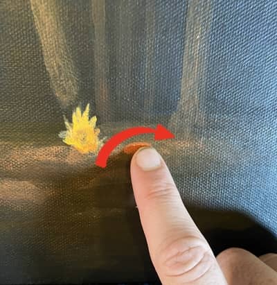
To start painting the glow I used a technique I learned from Chuck Black Art when I painted the candle that I mentioned earlier. You can find that video here.
He uses a technique for the glow where he adds the paint on very gradually.
The paint needs to be a bit watered down. Then you put a small bit on the canvas at a time while rubbing it out with your finger.
In this case, since there is some texture to the ground and it is the ground we want to illuminate I went out horizontally in small circles.
For my paint I started with a darker mixture of orange and red.
Then I gradually started adding a bit more orange and white into the mix.
Still watered down of course.
Once you get going, try not to overwork an area while it is still wet or you will rub off whatever you just put down.
If it’s not quite how you want it, let it dry before you try to change it and add more to it.
Pro Tip: Keep a blow dryer or heat gun handy so you don’t have to sit around waiting for it to dry!
Acrylic paint already dries pretty fast for the most part. It’s actually sort of a problem when you start painting in longer sessions. That’s a topic for another page though.
For now just experiment with this technique and use it to get a basic glow laid out.
For the trees, I didn’t actually rub them with my finger. I tried that at first but it wasn’t giving me the result I wanted. So just use a flat headed brush and the same watered down mixture for the trees.
You’ll notice the fluidity of the watered down paint causes the pigments to pool in some spots and thin in others. This good to get that textured effect of bark.
Especially since the flat headed brush tends to make the stronger collection of pigments in a nice edged line.
Add Another Layer to The Fire and Glow
In this step, we want to try to brighten things up a bit more. Start with the glow on the ground this way when you go to work on your fire you can paint over it if you need to.
This time, for the glow, instead of using my finger I tried using just the brush. I still used a watered-down paint mixture that was about half orange half red. Perhaps a bit more red than orange.
There were some spots where I still used my finger to smudge it out still but I wanted to get some of those stronger puddles of pigments to help create some of the ground textures further.
It didn’t really work out the way I thought it would. Sometimes the watered down paint backfires on your intent and it’s better to use paint that hasn’t been watered down.
We will get the details we want in one of the next layers.
I’m thinking it might be easier to get the overall are of where the glow reaches laid out first. Then we can come back later to add some of the darker shadows we see.
Next, I used the same watered down paint mixture to help brighten up some of the trees closest to the fire. Using the same method as last time gradually tapering the glow into darkness as we go up the tree trunk.
I tried to add a few more trees further in the background using burnt umber brown to give it a bit more depth.
After that, I tried to work on getting the color of that fire right. It’s still too muted and not quite the saturation we see in the picture.
That said, in the next few steps I need to start trying to emulate some of the strokes of the styles I’ve chosen to references for this painting.
So maybe instead of continuing to try and brighten it up, I will add extra strokes of colors to it. Take a little more artistic liberty with it.
You may have noticed I have yet to include a spot for the person sitting on the log. I’m not yet sure if I want to add that in or not.
I just knew going into it that I didn’t want to replicate that picture exactly as it is for this one. Getting better at art is all about experimenting and trying new things!
Related Articles:
- How To Paint Bubbles (An Easy Acrylic Painting Project!)
- How To Paint Clouds: A Step By Step Exploration Of Cloud Painting
- How To Paint Water (A Step By Step Guide)
- How To Paint a Sunset in 8 Easy Steps (Beginner Acrylic Painting)
- How To Paint A Butterfly For Beginners
Paint In the Rocks, Branches, and Shrubs
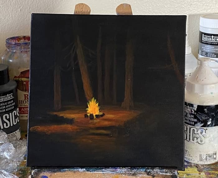
Okay, next thing we need to do is add just a bit more to the glowing area with a bit of yellow-orange that is a bit watered-down. Not too much this time though.
Yellow dries pretty thin and transparent as it is.
Use a flat headed brush, and with the paint mixture loaded lightly at the very tip of the brush, add a few more highlights to the glowing area.
Especially closer to the fire. As the paint thins on the brush, work your way out helping to ensure the brightness dims the further you get away from the fire.
Just like in the rest of my step by steps, we will continue to tighten it up in the next few steps as we work down towards the smaller details.
So if you are feeling uneasy about anything looking messy or not how you want it at this point, make a mental note of it so you can tackle them in the next steps.
I also tried to brighten up the fire a bit before starting to add the rocks around the fire.
For the rocks, I used black mixed with a bit of brown. It’s mostly the ivory black though. I tried to get the bright reflection of the fire off the backside of the rock furthest but it came out blurry.
Perhaps we will add more to that on the next step to see if we can bring it more into focus.
Once the rocks are added, use a small pointed brush to start adding branches to the tops of the trees. Painting them on with a dark brown like burnt umber so that way they are submerged in darkness.
We may brighten them up in the next steps but I’m not too sure about that yet. Sometimes you just have to go with the flow.
I did try to add in a few more trees and bring the one all the off the right side of the canvas a little more into being.
If you’re using some other reference picture we’re getting close to the lower end of the spectrum of shapes. So just focus on what those are in your references and continue working your way down.
Brighten the Glow Further and Add to the Shrubs
In this step, start by brightening up the glow even further. We’re still using the same gradual techniques we have been this whole time by using a slightly wet brush to thin the paint a bit.
Be aware of where the rocks are. While they barely block the light from the fire at all there are some spots where you can give the effect of them casting a bit of a shadow.
Use horizontal strokes with a flat brush to get sharp lines where you need them. This will help create the effect of uneven ground.
Also, be sure to go over the rocks around the fire with another layer of black to help make them a bit more solid.
Once we have the area closest to the fire a bit more illuminated next we work our way up the tree closest to the fire. Use just a tad bit more orange in your mixture.
Try to let the paint thin as you work your way up the tree to help keep the effect of the light fading.
We want the underside of the branches to glow a bit too. Here I have a picture of all the brushes I’m using in this layer.
For working my way up the tree I’m using the small flat headed brush second from the top. For the actual branches I’m using the tiny pointed brush above that.
Once you get the tree looking how you want it next we move on to the foliage in the foreground.
Now in my original reference picture there are a lot more twigs and branches coming out of both the trees and the bushes. I wanted to just keep it simple though so lets just make them bushes.
To do that I used the thick white coarse brush at the bottom of that picture. I loaded one half with ivory black and the other half with cadmium orange.
Then I pressed it into the canvas where I wanted my bushes to go in the foreground. Keep the orange closest to the side with the fire.
This will give the appearance some of the leaves are getting hit with light.
Do the same thing on the other side of the painting as well.
With our last layer, we will finalize the painting by correcting any glaring mistakes or annoyances. Let’s see if we can make it just a bit better before we sign this sucker!
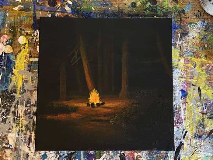
Add the Flames Above the Fire and Another Layer of Shrubs
Now we just have a few things left we need to do to wrap it up on this one.
First, add any further glow details you feel you need to on the ground.
There were a number of spots I wanted to brighten up or add color to. Mostly on what looks like that pathway between the view point and the fire.
You can also darken up some of the shadows that the rocks are casting. This really wasn’t in the main reference picture but was something I drew from some of the paintings I was using as references.
Adding little black spots here and there to make the ground look a bit more uneven.
Then add a bit more of the glow to the tree all the way on the right side of the canvas by adding a bit of cadmium red to it.
After that, brighten up the tree to the right of the campfire. That tree is getting a bit more light than what I had on it in the last step.
Once we’ve done all those things we are now ready to add one more layer to our shrubs on both sides using the same method as before.
Now that we are coming to a close on this one let’s assess how we did with using our reference pictures. It is important to reflect and think about how we might be able to use them better next time.
Especially since in this one, it was my first time trying to use more than one reference.
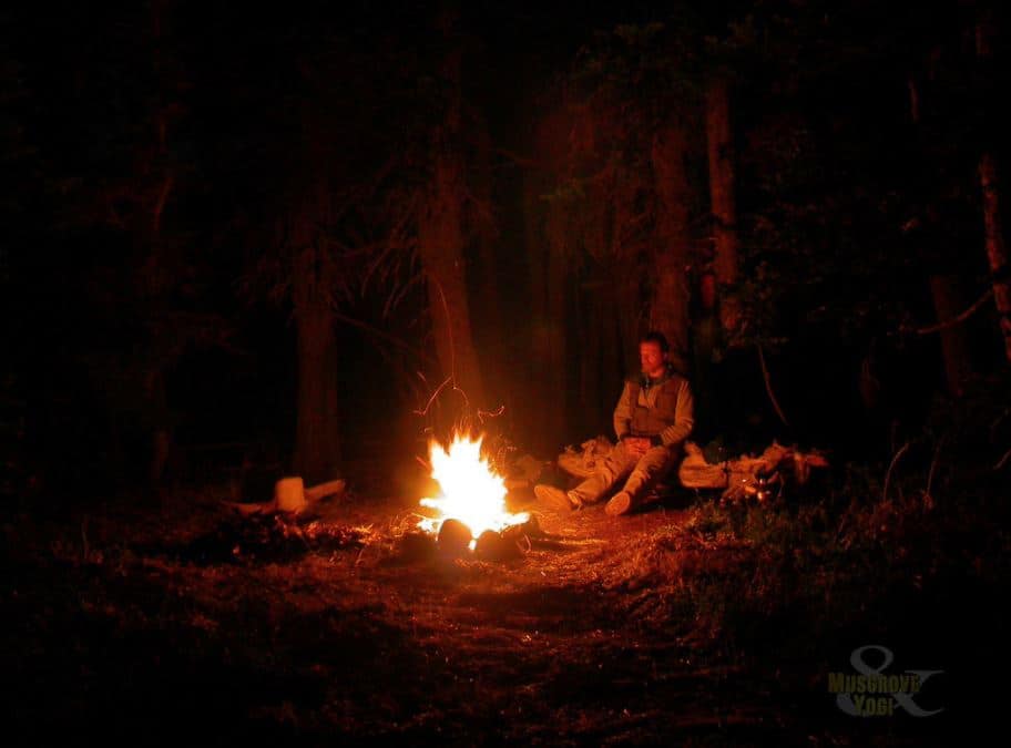
The picture on the right was my main source of inspiration. It was posted on Flickr by a profile named Musgrove and the Pumi and is something I discovered on Pinterest.
I opted to take some artistic liberties with it but it bears a representation of it.
Then there were these two paintings in particular.
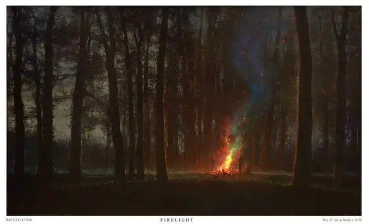
Both of these paintings embodied a certain glow effect from the campfire that I wanted to capture.
Mine ended up being a bit more muted in the colors like the one on the right is.
I wanted to draw some of the elements of brush strokes from the one on the left but the techniques I was using to get a soft glow weren’t really conducive to that style of painting.
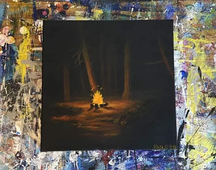
All in all, we were able to pull off our own original campfire.
Did you make it this far with me? How did yours come out?
If you followed along with me and want to share your artwork you can tag me on Instagram using @learningartwithmarc_ or use the hashtag #artwithmarc.
I would love to see your work! Especially if this guide helped you to create your own work using multiple different references.
I hope you learned a thing or two by reading this article or following me along with it. Now, let’s move on to the next one!
