At this point in my artistic development, I have painted many things, but for some reason I have not painted any type of flower. As one always seeking to advance my artistic skills I think it’s time to take on the challenge.
One of the most commonly painted flowers people want to know how to pain is a rose. Let’s start by learning how to paint a rose. A classic symbol of love and secrecy.
Flowers and floral patterns in general are a pretty standard subject in the art world.
Now, anytime we are looking to do something we have never done before there are a few ways to approach it to ensure you get successful results.
This sequence of steps is my current approach. That approach is constantly changing too as I learn new things. I’m sure yours will as well as long as you are pushing yourself to learn new things.
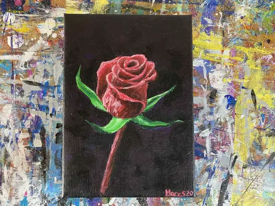
I don’t think the rose featured above came out as abstract as I had hoped but you will see what it was I was going for in the next section.
Gather Your References and Inspirations
The first thing we need to do is gather up some references and inspirations.
Lately, this has become an integral part of my process and something I’ve been trying to push my skills on.
So to start with, I usually go to Pinterest and create an inspiration board on whatever the particular subject matter is that I want to paint. If you’d like to use my Pinterest board for roses you can find it here!
I like to collect a mixture of artwork and pictures so this way I can draw on multiple sources of input. At least that is something I’ve been trying to develop into my process.
To that end, once I have a collection of different styles of paintings and cool pictures I then pick a few to make a quick collage out of.
Pinterest will let you download images to your device. So I download the ones I want to use. Once I have them on my phone I then use the Instagram Layout app to create a quick collage like what you see here.
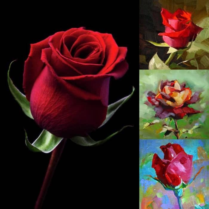
This is a rather new part of my process but the idea is to create something original by pulling different things from each reference.
This way you’re not just copying someone else’s work. Plus, you can “taste test” a lot of different styles this way.
As a beginner painter, you may not have your own style yet. Maybe you’re still looking for it. Me too!
Perhaps using an approach like this will help you discover what your style is. Trying to paint the same thing in different ways too could be another option.
Anyways, the main point in the collage approach is attempting to develop originality into our work.
Before I blabber on any further, the painting at the top right of the collage is by an artist named Qiang Huang. Unfortunately, that particular piece is already sold but if you click here you can go check out some of his other work that is still available on the site DailyPaintWorks.
The next painting down is by Anne Ducrot. It seems Anne also has a selection of paintings available here on that same website that I’ve never heard of until now. I may have to add it to my research list as it seems to be a place artists can sell their work.
As for the last painting a the bottom, this one is by by Elizabeth Blaylock. She has her own website here where she blogs and displays her work.
I guess the thing I like and that is common between the three of these paintings is their use of loose paint strokes. That is the main thing I will be aiming to capture in the style of this painting.
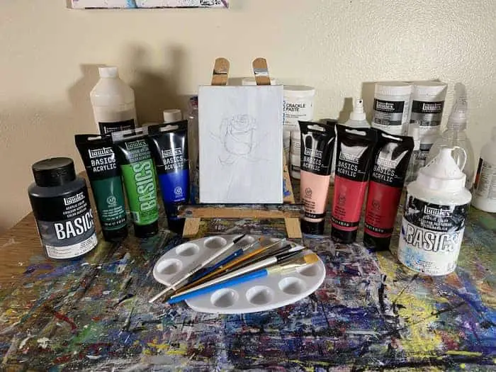
Gather Up Your Paints and Other Supplies To Prep
For this painting, I would recommend taking the time to do a few pre-game sketches. We will go over that in the next step.
This is a good practice to get into for anything you’ve never painted before.
With that in mind, you will want to grab a sketchbook and pencil set to have handy.
As for the paints you will need, that all depends on if you are using the same references as what I’m using here.
If you decide to follow along with what I am doing, here is a list of the paints I have collected:
- Naphthol Crimson
- Primary Red
- Portrait Pink
- Green Deep Permanent
- Light Green Permanent
- Primary Blue
- Ivory Black
- Titanium White
It is likely I won’t use all of these colors but I have them on hand just in case I will need them. As always, there may be others that find their way into the mix as well.
If you’re using your own references then just do your best to collect what you think you will use. The more you work your own references and choose your own colors the better you will get at it and the less you will need step by steps like this one.
For the canvas, this time I’m going to use a smaller 5″ x 7″ canvas. Of course, you should use whatever you have available or are most comfortable with.
I had previously prepped this canvas with a couple of layers of gesso a while ago. That is something that is totally optional and not really necessary.
Lately, I’ve decided that in most cases putting gesso down on the canvas prior to painting is just an extra step that isn’t needed. So I probably won’t be doing that as much going forward.
You should, however, feel free to make up your own mind on that. If you have gesso that you might want to use there are pros and cons to it.
For my paint brushes. I have a selection of six different paint brushes pictured below.
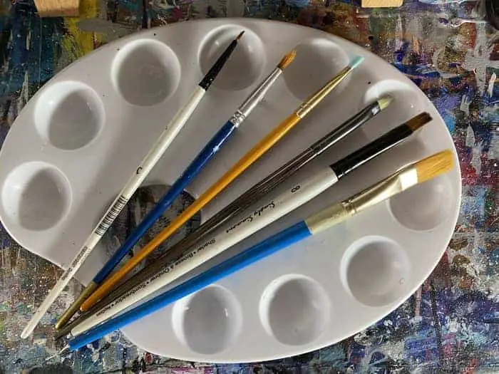
We have a couple of different sized flat headed brushes, a blender brush, and a couple of other brushes that I don’t know the names of.
There is that one brush with a 45% angle on it. I don’t know what it’s called but I’ll have it on hand just in case. To be honest, I doubt I will even use all of these brushes.
It’s most likely I will use the flat headed brushes for most of the painting. I guess we are about to find out!
Before we get started painting we have one more step of prep work.
Thumbnail It then Lightly Sketch It Onto Canvas
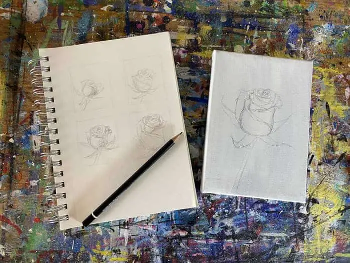
The next thing we need to do is prime our visual cortex with some practice sketches.
For a while now, I have occasionally heard artists referencing the practice of “thumbnailing art” out. Just from the context of when I heard it used it sounded to me like a way of brainstorming your artwork.
When trying to create something you’ve never done before it definitely helps to sketch it out and thumbnailing is a technique I’ve never tried before.
Since I felt inspired to try it out I looked it up just to make sure I understand it and that is more or less what it is. It is a way to make quick iterations on a subject matter. To play with shapes and perspectives.
To not worry about principles and just put pencil to paper and hash out some ideas.
We all are generally pretty familiar with what a thumbnail is in this day and age. Thumbnailing your artwork is when you draw small sketches of it to get an idea of values and compositional options.
They are supposed to be quick sketches placed in small boxes scaled way back on details. Really, how much detail you want to add is up to you but part of the point is to quickly work out some of the problems you might encounter.
Some people do quick scribbles while others are looking primarily at values.
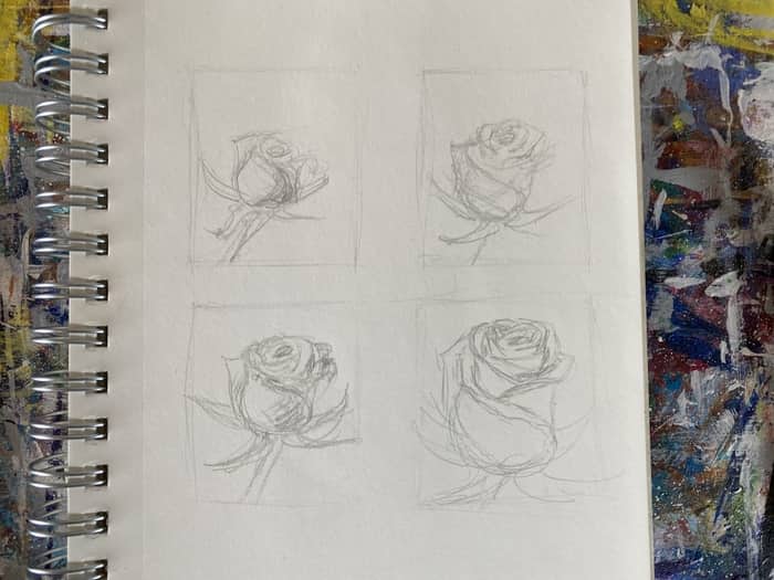
Here you can see me making my first attempt at using thumbnails before a painting.
I’m experimenting mostly with the sizing and the basic features of the rose. Doing these thumbnails helped me work out how to draw the petals of the rose to get that layered look.
The rose petals are essentially a series of arches and triangle-like shapes that wrap around onto each other.
I can definitely see how this helps and likely will start working this thumbnailing tactic into my process.
It helped me to formulate a mental plan of action for the canvas. If you’ve never tried thumbnailing now is the time to give it a shot! I think it will really go a long way towards helping you develop further as an artist!
When I did finally go to draw it on the canvas though I feel like I still made it a bit too small. Which is okay since we are going to paint over it all anyways!
We can just use it as a basic guide and make the necessary adjustments as we go.
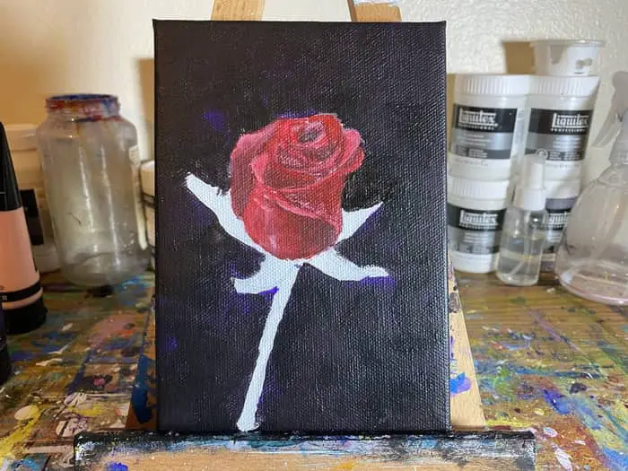
Paint Your Background Black and Purple
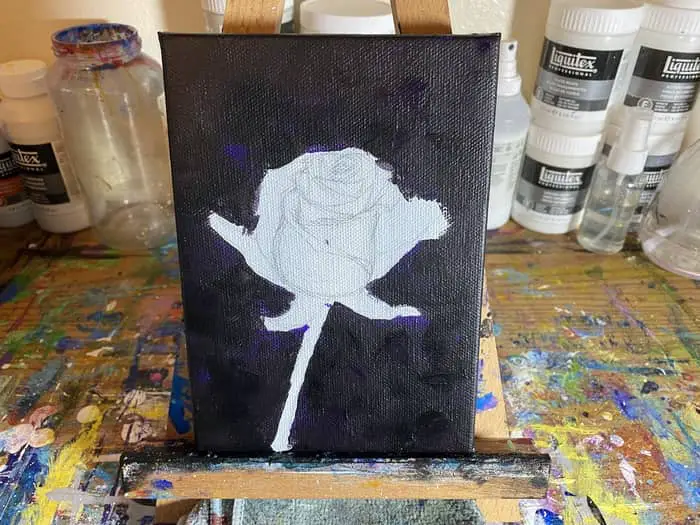
Now that we have our rose laid out let’s paint in the background.
Since my main reference has a black background I’m going with ivory black and dioxazine purple for my background. I may add a brighter purple just to create more diversity and get more of those brushstrokes in the background.
That all depends on how the rest of the painting goes and how it’s looking when I get to the last step.
It took two layers to cover the background completely using my 5/8 flat headed brush. The fact that it took two layers is pretty standard as acrylic paint dries a bit transparent.
Even the most saturated colors do. Just be sure the background of your canvas is completely covered.
If you’d like to take some artistic liberties you can of course use whatever colors you feel inspired to go with.
I would recommend keeping it dark and at least in a color scheme that works with the red and green of the rose.
If you happen to be using a different reference picture that has more colors in the background just keep it obscure and blurry like we see in the style examples.
For the most part, this step is pretty straight forward and simple. Just paint right up to the outline of your rose and you’re set.
Once we have the background painted we can start working on our rose and filling it in. We will expand slightly on the layout we have in pencil to ensure it overlaps onto the dark background.
Related Posts:
- How To Paint a City Skyline (Textured and Abstract Style!)
- 10 Abstract Artists on YouTube to Study and Learn From
- What Makes a Good Abstract Painting? The Principles of Art
- 10 Artists Who Wield a Palette Knife With Mastery (Study The Best!)
- Abstract Art Projects To Try
Paint the Rose With Red, Dark Red, and Light Pink
Now we begin the fun part, painting the rose petals.
This step is all about defining the petals we got all that practice drawing out.
I found the practice I got from doing the 4 thumbnails before starting the painting enormously helpful. It’s sort of surprising how much it helped prepare me for the actual painting of the flower.
Maybe next time I’ll bump it up to 6 thumbnails and see if I can come up with other variations to try out too.
Doing that practice was great for getting a feel on the shapes and rhythm of the petals. How they drop into a dark shadow as you go lower on the petal where one wraps over onto another is an essential key to getting being able to distinguish between each petal.
Knowing how each petal is supposed to be and how I need to create a gradient to get the right effect was very helpful in guiding me here. Between that, and getting a physical feel for the arches, bends, and folds of the flower, thumbnailing my painting had a huge impact on my ability to execute on the vision more easily.
To get the darker parts just mix a bit of black into your red. The wet on wet blend technique is an easy way to get the gradient we need.
If you’re not familiar with that technique what you do is apply your dark paint in one area and your lighter color in the area directly adjacent to it quickly after that. Then gradually blend them together where they meet.
You can use the light pink as well to mix with your red to lighten it up just a bit and create some lighter highlights where the petals fold over and the light hits them.
The main thing we are trying to accomplish in this step is to fill in each petal and make sure that they are individually distinguishable to some extent.
Since we are ultimately going for an abstract look we can keep it loose but we still need to be able to discern that it is a rose. The petals are a pretty important part of that.
Next we will get the first layer of the step and leaves. Then we will come back and add more brush strokes to everything building up our abstract style that we want.
Paint The Leaves and Stem
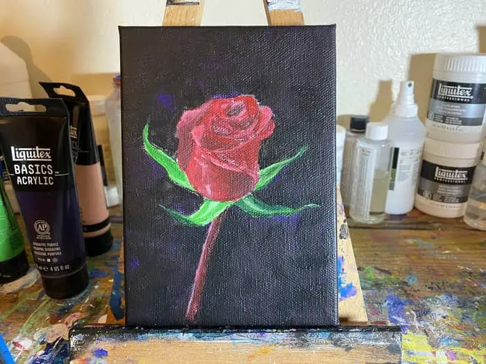
In this step, we need to put the first layer of colors down on the leaves and stem.
To do this, use the light green and dark green paints to start filling in your leaves. Be sure to get some variations in the blend using the wet on wet technique.
Mix some black paint in the dark green paint for some of the darker shadows like underneath the leaves where they curve up. Then add white into the light green paint for the lighter highlights where the light is reflecting off the curves of the leaves.
The stem is a similar dark red as the shadows on the rose. Fill in the stem with a dark red shadow on the right side using the wet blending technique to blend it into the red in the middle.
Then mix your red with a dab of white to add a highlight down the left side of the rose’s stem.
The light is clearly coming in from the upper left side of the canvas due to how everything on the left side of the flower is light up. That’s just something to think about and consider when trying to get your values right on anthing.
If you’re having any trouble, just ask yourself what direction is the light coming from? I find that helps me sometimes.
As we move forward to add more layers we need to start adding heavier strokes and attempting to get a more scattered abstract look to the rose. We still need more colors to help create better depth between the shadows and highlights on the flower’s petals.
Add Shadows and Highlights to Create Depth
In this step we start to pull it together a bit. Working primarily with our reds and pinks we’re looking to build on the flower and stem.
Here is where we are going to deliberately attempt to leave some thicker strokes visible. Start with the dark red and mix a bit more black in this time to make it even darker than we had it before.
It may be better to say you’re mixing a bit of red into your black.
Then darken up some of the shadows a bit further. Especially in places where there is overlap or curves.
Once you do that, use portrait pink mixed with just a bit of red to start adding in some highlights. The light reflecting off some of the edges of the petals really can help make things pop.
More specifically, it’s a pretty essential detail to be able to illustrate the roses different petals that comprise the whole rose. These reflective highlights of the light reflecting off of the folds of the flower and the shadows that give it dimension both work in symbiosis to give the flower the depth.
Making it look like the three dimensional object that it is.
When working on both of these features be sure to leave chunky stroke lines so we can get that abstract style we are looking to get.
Another thing we are trying to do is make sure we get all of our pencil marks and canvas covered on this go. Since we drew the flower on and have been building on top of that there may be some white spots of the canvas showing through still.
We need to make sure to paint over all of that in this step and the next step. I don’t know about you but I don’t want any of that stuff showing through the painting.
Plus, any spot on the canvas that isn’t covered with paint I will notice and it will bug the snot out of me. Let’s wrap this thing up in the next step!
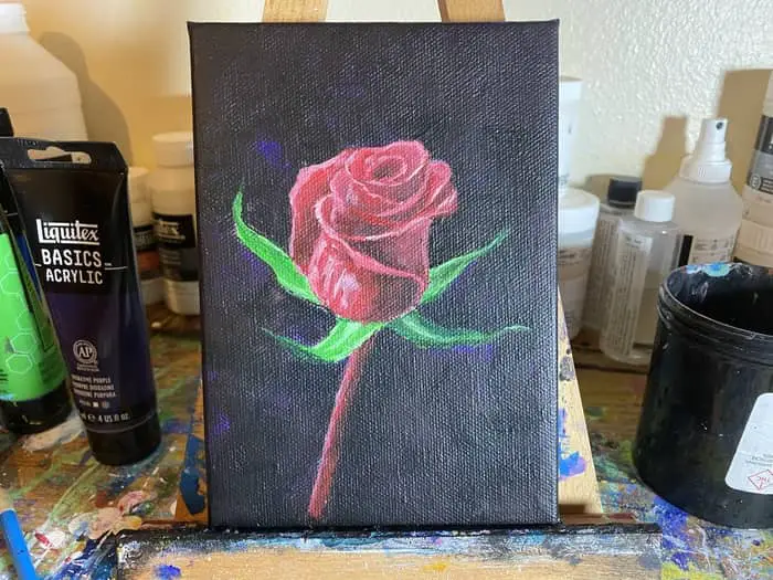
Add Saturated Paint Strokes for More Detail

In this last step, we just need to deepen the colors we have by continuing to build on the shadows and highlights.
Using the smallest brush I have, the one I mainly reserve for signing my name, I tried to add in the more abstract brush strokes we were going for. That effect is a bit harder to get than I thought it would be.
Ultimately, what we need to do to deepen our highlights and shadows by adding more saturated colors in the mix.
In some areas, where the shadows from the petals are the darkest, you will want to use straight black. Then work your way out and up the petal to get a good gradient from the shadow up the petal.
This gets much more difficult to do as you get further up the flower and the petals get smaller. At this point, it’s all about the minor changes. The tiny brushstrokes of details.
Build them up gradually attempting to leave a pattern of thick brushstrokes between shades as you accentuate your shadows and highlights.
Speaking of the highlights, at this stage you should be using almost straight portrait pink. If you find that is just a tad too bright then add a small dab of your red paint to it to tone it back a bit.
You may notice that this particular color really helped to define the rim of each petal. So be sure to use it to help make those petals pop a bit more with that reflective light.
Plus, since this is the brightest color on our palette, it’s a bit easier to get some of those paint stroke effects we are looking to get.
Between adding more saturated black paint strokes to our shadows and more saturated pink paint strokes to our highlights we should really be seeing this rose come into focus now.
Sometimes a painting really can come together nicely in the last few steps.
Once you are satisfied with the shadows and highlights on the rose work your way down to the stem. Add any additional details you feel are necessary to add.
I just added more highlights on the left side of mine.
Finally, we finish it out by going over the leaves one last time. Thus far we have only done one layer of green on them and we need to do at least two to ensure the canvas is fully covered.
So go ever it all one more time making any corrections as needed. Adding any reflective highlights you need to add with a dab of white mixed into your green.
Once you do this the painting is pretty much done. The only other thing I did after this was take some black and dark purple paint to hit the spots of the background that looked too thin or had canvas showing through.
Then, when you’re totally satisfied with what you have, sign and date your painting! Then snap a picture and post it on Instagram with the hashtag #ArtWithMarc so I can find it and share it with my followers!
You can always tag me in it too. You can find my Instagram profile here!
