When I first started painting my first project was a galaxy painting, an acrylic pour, and then I did my first abstract painting.
Abstract painting is another great way to get acquainted with painting.
It is a bit more loose and free-flowing. Allowing one to explore painting in a less judgemental way.
I think the key to making the most out of it is to approach every painting you do with an awareness of what principle or technique you are trying to practice or learn.
As an example, working abstractly is a great way to experiment with the color wheel and the various color harmonies one can go with.
This is certainly something I would encourage you to think about as you work on the projects below.
Not only will these abstract projects help you understand color theory better but they will also help you get a feel for how to blend colors.
Through doing abstract works you can gain an understanding of texture and brush strokes. How to do a wash or how to work with a palette knife.
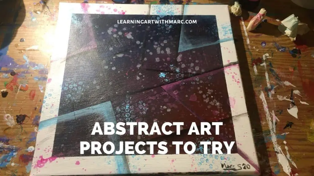
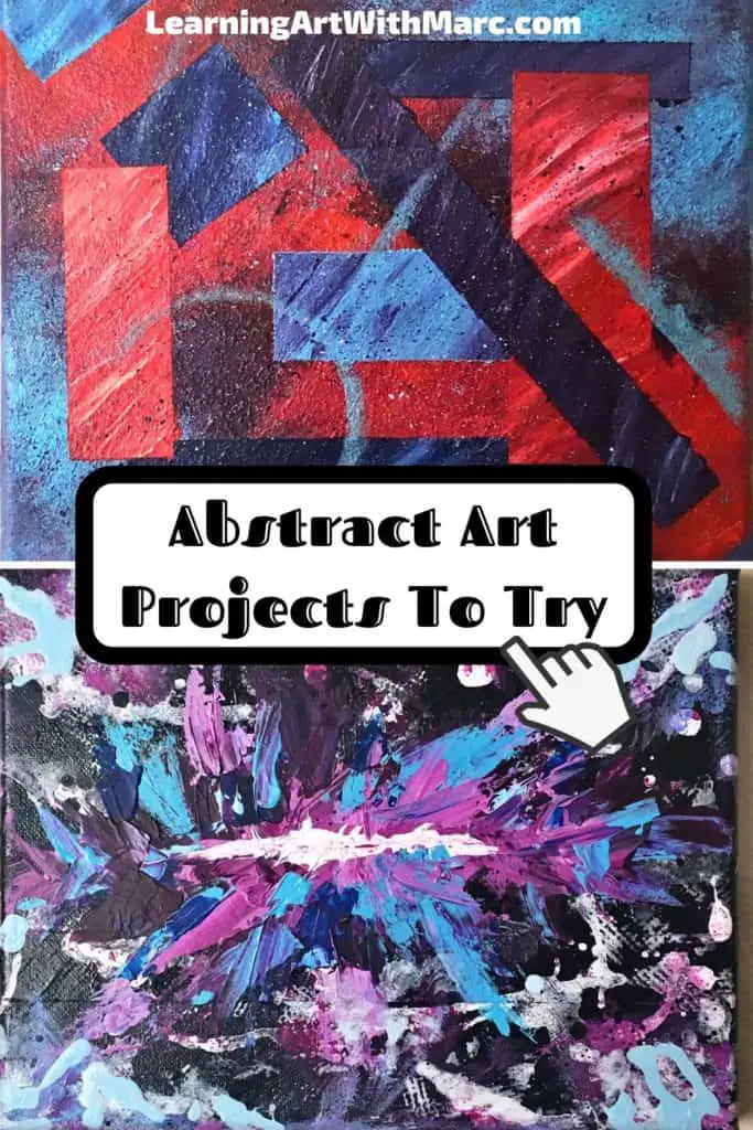
There is much to be learned by trying some abstract paintings projects.
That said, let’s take a look at a number of abstract art projects for you to try and ways to approach creating your own abstract art projects as well! There are so many resources at your disposal you should never be at a loss for what to do next.
If you are though, that’s ok. We all have those moments. That is what pages like this are meant to help with.
Here I will be collecting a series of videos produced by various YouTube artists in order to analyze and learn from what they are doing.
After that, there are a ton of great abstract art ideas to get inspired by on Pinterest and Instagram as well. Pinterest is one, in particular, I have been focused on lately so we will see what sort of jewels we can mine there too.
Related Articles:
- How To Paint a Rose Abstract Style (Easy Step by Step)
- Making Abstract Geometric Art For Beginners
- 10 Artists Who Wield a Palette Knife With Mastery (Study The Best!)
- 10 Abstract Artists on YouTube to Study and Learn From
- What Makes a Good Abstract Painting? The Principles of Art
Abstract Artists On YouTube To Inspire Your Abstract Art Projects
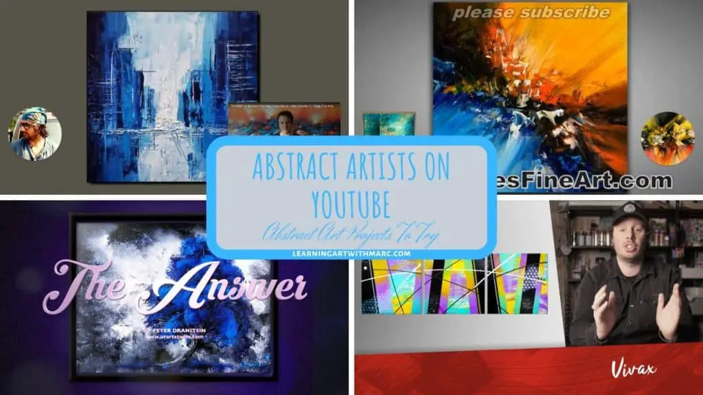
Let’s start where I initially started, YouTube. There are so many amazing artists on YouTube to learn from. Sometimes it is hard to choose one to draw inspiration from.
There are a number of abstract artists on youtube that I have wanted to study and do some projects based on. I figure this is a good opportunity to do just that!
Thus far, I don’t think I’ve seen an abstract artist yet that really breaks down and explains what they are doing and how you can do it too. That is what I’m going to be doing here with the assistance of their videos.
The ones I have learned from generally record themselves painting with some background music. Surprisingly enough, there is much to be learned by observing them in this way.
From the tools they use to the very way, they apply the paint. So lets study and create some abstract art projects to try based off of their works!
John Beckley Inspired Painting Project
I want to start with one of my favorite artists, and one of my first inspirations, John Beckly.
For this project, we will take a video of John’s for inspiration and then attempt to create something like what he does. Let’s see what we can learn from this brilliant artist!
Ok, let’s break this down into some easy steps for anyone to try.
There are going to be some things that he does in the video that I’m going to omit from mine as I don’t have the right tools for some of them.
Maybe I can come up with some unique alternative to try.
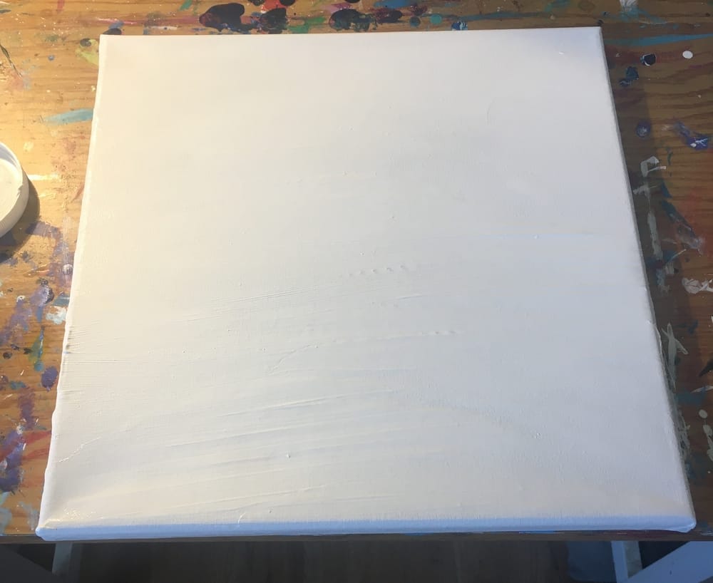
For mine, I’m going to be using a 10″ x 10″ canvas.
He doesn’t specifically show this in his video but I went ahead and prepped mine with a couple of layers of gesso and a layer of white paint.
I, of course, applied one layer at a time letting each layer dry before the next.
Once I did that I went ahead and taped off the borders of the canvas like what he shows at the start of the video.
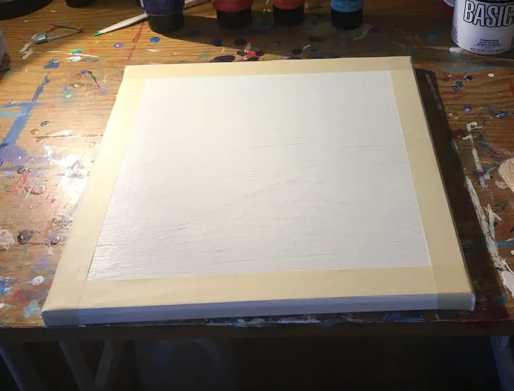
This is a technique called masking and is quite useful when making abstract works like the one we are doing today!
Now we are at the point where he actually starts his video. The fun part for us! Putting paint on canvas!
The first thing he does is use a series of analogous colors.
So to follow his lead but do my own thing I went with red, purple and blue.
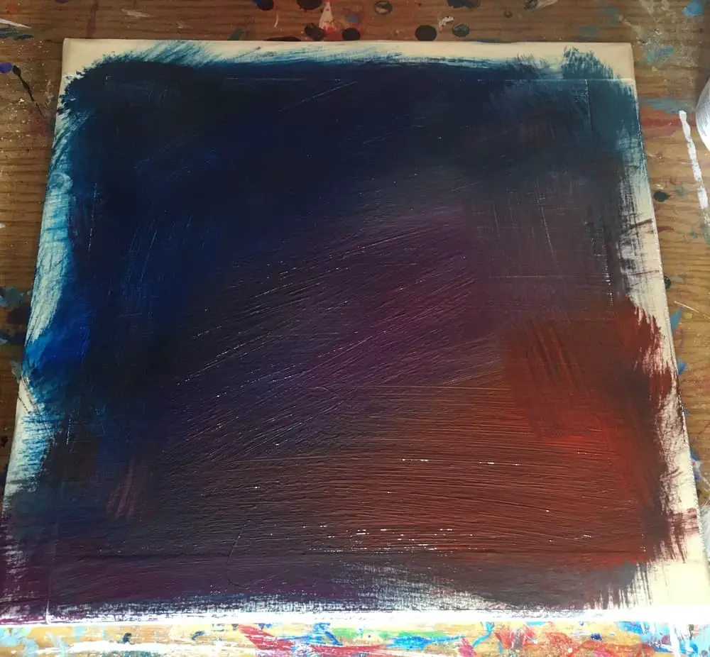
He makes getting a good blend look a lot easier than it was for me. I think I need to practice a bit more. To get that good.
Next, I removed the tape and hit the canvas with what I’m calling a wash splatter.
I don’t know if there is some sort of proper name for this technique but you can see in the video where Beckley hits it with watered down paint.
When you water down paint like this it is called creating a wash. So the wash splatter seems like an appropriate name if you ask me!
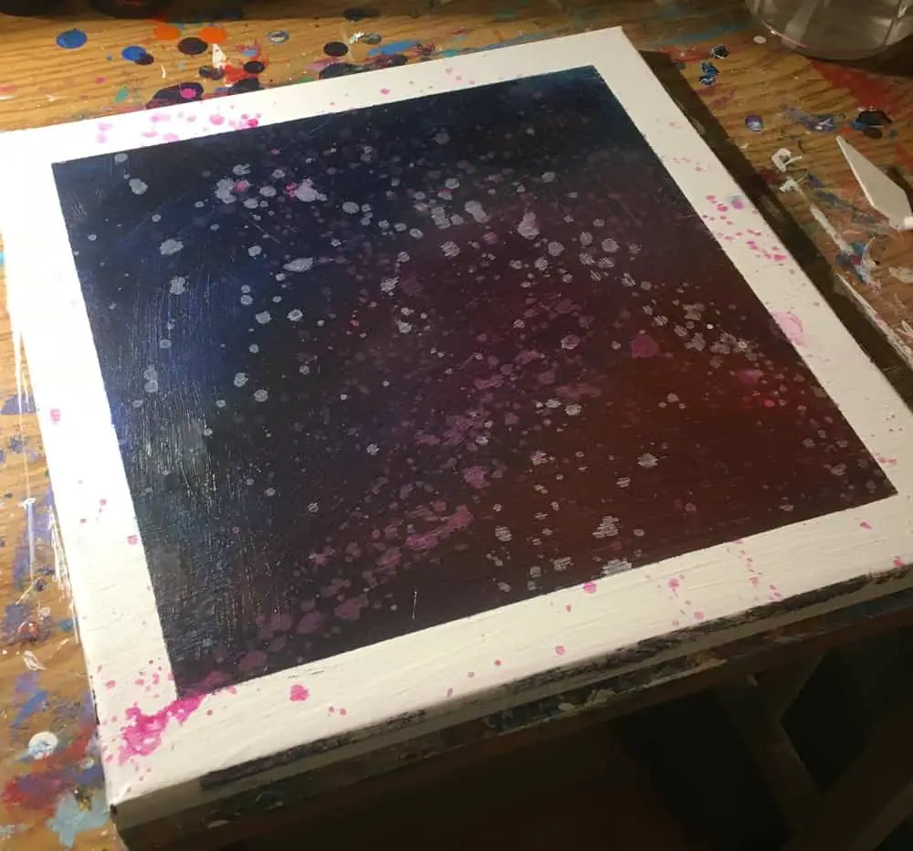
This ends up leaving some cool stains once it’s dried.
For mine, I went with pink and white splatters. Don’t be afraid to hit the white borders. It is part of the effect we are going for here.
For the next step, this is where I start to do things a bit differently than in the video. I don’t have all the stencils and stuff that he uses later on so I decided to use bubble wrap instead.
This is actually a technique I got from watching other John Beckley videos.
Feel free to get creative though! Keep an eye out for regular every day items like bubble wrap that can help you leave cool effects on your painting.
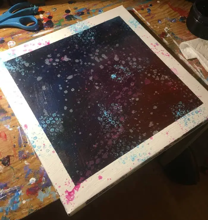
So just to add a bit more character to mine I added light blue using small bubble wrap. I specifically targeted more around the edges.
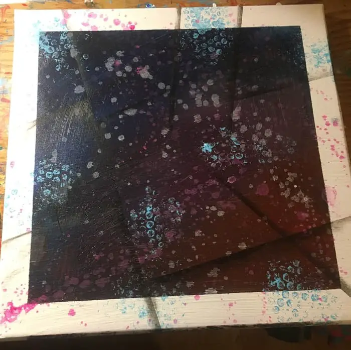
Next, we use more masking tape for our next effect. As seen in the video I placed masking tape in angular positions to dry brush on some black shadows.
One thing to think about when doing this is how you may want to guide the eye around the canvas. Keep the rule of thirds and the golden ratio in mind.
If you’re not sure what the rule of thirds is, pretty much all cameras and smart phones these days put up a grid on screen when you go to take a picture. That grid is dividing the picture up with the rule of thirds.
Each intersection of the grid is where ideal locations are to put focal points. Pull our your phone and give it a look!
Just like he does in the video I added mine in different sections instead of all at once.
While I don’t have all of the tools John uses in his video I decided to add a bit of my own flare to it. I kept seeing a bit more pink and blue in there.
So for my last step, I dry brushed them in like what we did with the black. I actually did it over some of the black sections.
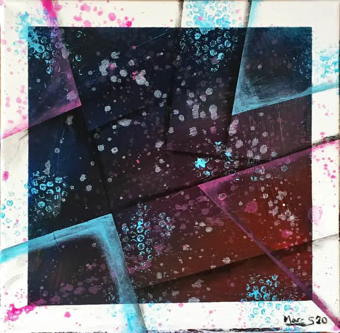
When it comes to abstract painting, especially if you are starting without a clear end result in mind, you just have to ask yourself when it “feels” resolved or complete.
This is where I decided this painting was completed. The original intention of creating a John Beckley inspired painting fulfilled.
We learned a bit about blending our colors, wash splatters, bubble wrap effects, and some different uses for masking tape!
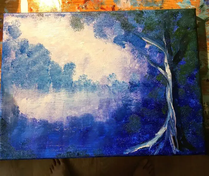
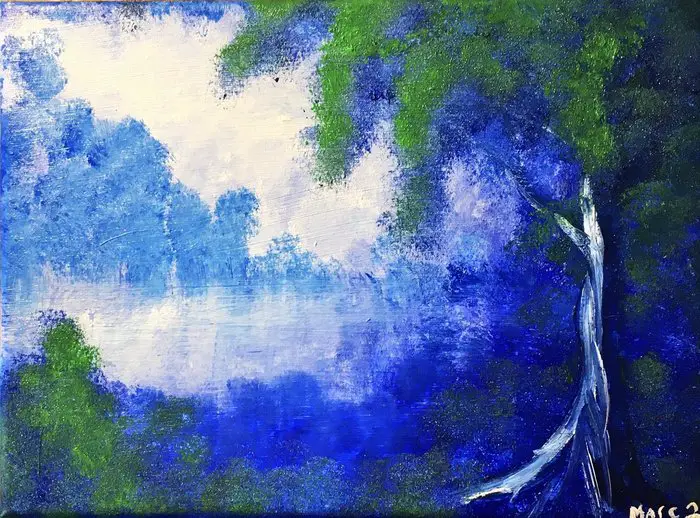
Peter Dranitsen Inspired Abstract Landscape Project
Another great YouTube artist to check out and whose channel I personally follow is Peter Dranitsen.
He focuses primarily on abstract landscapes. So for this one, we are going to draw inspiration from the techniques and brushes he uses in his videos.
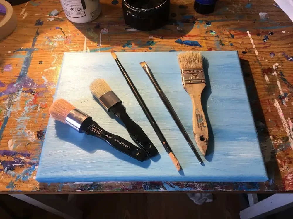
While I don’t have the exact brushes he uses I have some that are close enough I think I can get similar results.
The cool thing about Peter is that he uses pretty simple techniques that are quite easy to observe. Once you follow along with a number of his videos you’ll learn to create original abstract landscapes of your own.
For this project, I’m going to use almost the same colors as what he is using in the video. I repurposed an old canvas that had something on it I didn’t like.
This is one of the great things about working with acrylics and why you should never be afraid of making mistakes. Even if you get to a point where you feel like the entire painting is ruined you can always paint over it and start something new.
I don’t have the exact brushes Peter uses in the video so I grabbed a handful of brushes that are similar. I didn’t end up using all five of these. Just the second, middle, and last brushes you see here.
For this painting, instead of drawing from it to do my own thing I decided to try and follow Peter along in exactly what he was doing. I don’t have too many landscapes under the belt and I liked the particular outcome he gets.
One other thing I would recommend having handy is a spray bottle of water. To get some of the same effects that Dranitsen gets, you will need the paint to still be wet on the canvas.
Which can be a bit of a challenge if you’re learning how to do it and need to stop to follow a video or read some steps.
STEP 1: Put your paint on your canvas.
The first thing to do is put your paint on the canvas arranged as seen in the picture and in the video.
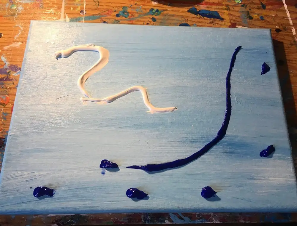
The goal here to cover your canvas with paint while beginning to create a bit of atmospheric perspective.
To get this effect start by working in the white just like Mr. Dranitsen does in his video. Then move over to the blue and gradually blend the two.
Keep in mind due to the thickness of the atmosphere, the things that are farther away are going to be lighter and more opaque. The things that are closest are going to be darker and more saturated.
STEP 2: Work your paint on to the canvas.
You could really do this landscape example with any colors you want. If you watch enough of Peter’s videos you’ll see him do landscapes of nearly every color there is.
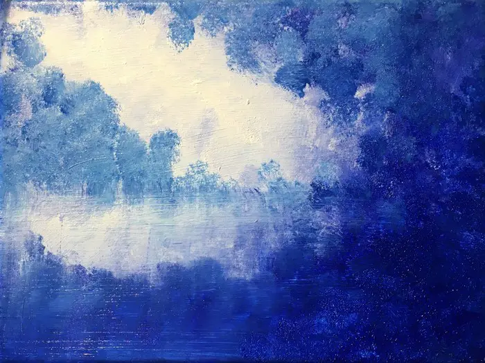
Just like he does in the video, you want to start by spreading around your white paint first.
This will allow you to blend the darker blue with the white creating a bit of that atmospheric effect we are looking for.
Once you get to working your darker color into the canvas you need to dab your brush to get the effect of foliage we want. As the paint thins on the brush, work your way inwards.
Then while the paint is still wet enough be sure to take a large flat brush and create your water effect. To do this you just dry brush it swiping down and then horizontally.
STEP 3: Add additional colors.
This is where I diverge a bit from the video. He then adds a “Payne’s Grey” to darken up the foreground a bit.
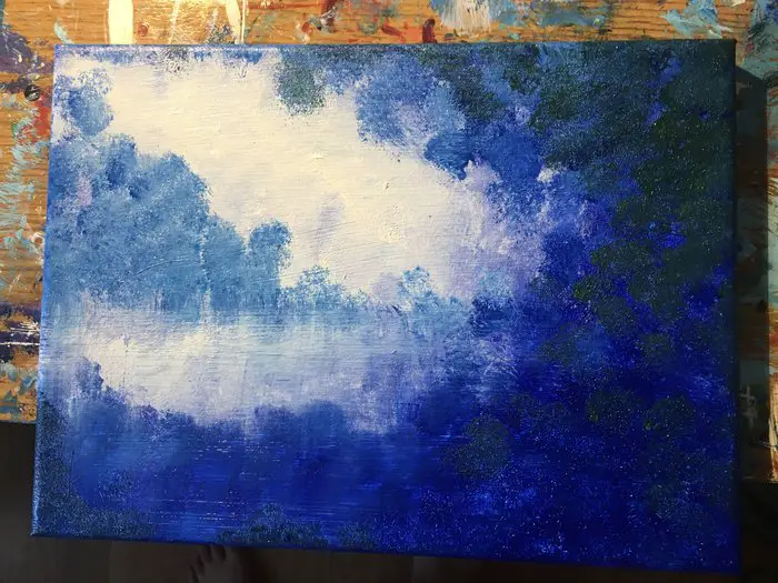
I instead decided to use a dark green to try and get a similar result.
I’m certainly not nearly as adept with the brush as Peter. I have a long way to go to get that good.
He is also using a different brush as well.
It doesn’t matter though. All that matters is we try. With every attempt, we will level up our brush skills, our paint mixing skills, and our visual libraries.
STEP 4: Add your tree trunk.
Next, while your paint is still wet, take your size four, round pointed brush and make a tree trunk through the paint in the foreground.
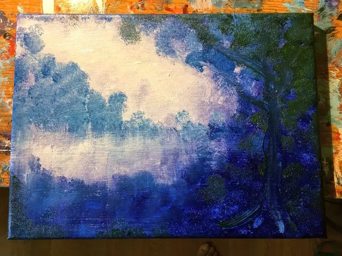
It will be a bit difficult to see at first. That’s ok.
We will add more to it in a moment.
Right now the idea is to get the structure of the tree laid out. As well as creating a bit of texture through the paint.
All that really matters is that we start to define where it is and what it is that is holding up the structure of this scene.
I also added quite a bit more dark green dabs too to try and create a bit more depth.
STEP 5: Add depth to your tree trunk.
The next thing you need to do is add a bit more depth to your tree trunk.
To do this we start by taking one of our darker colors from our palette and adding it to the right side of the tree and branches.
This is of course because this is the side receiving less light.
Alternatively, we also want to add white to the other side of the tree to show where the light actually is hitting it. Thus helping the tree to stand out.
Now, by adding these two colors, you can clearly see a tree trunk is there.
STEP 6: Add depth to your foliage.
In step 6 we add depth to our foliage by dabbing in a bit more of our darkest blue.
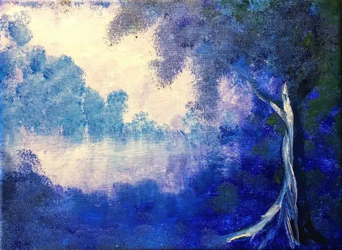
Here we create a bit more of the hangover towards the center of the canvas.
You basically want to add more to your foreground to make it stand out a bit more.
Ultimately preparing it for the final step of adding our highlights.
I personally think I could have done this step and the next one a bit better myself.
STEP 7: Add your contrasting color of choice.
Again I followed Peter’s example and went with green as my final color too but if you’re working with different colors that is fine too.
Just as long as they are harmonious with each other in some way it should work out just fine.
Just dab your final color of choice onto your canvas like we have been doing with every. Of course, using the same brush you have been using as well.
You want to try and do a better job of blending than what I did there. I think I laid on the green a little too heavy. As a result, it didn’t blend all that well with the blue.
So maybe learn from my mistake and make sure there isn’t too much paint on your brush before you start blending it in.
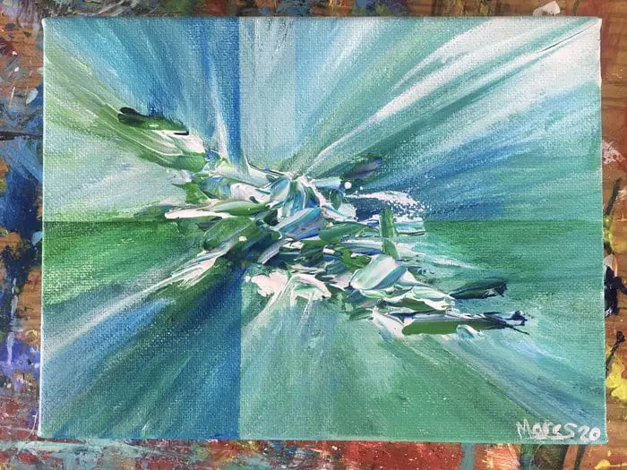
Ray Grimes Art
The YouTube channel Ray Grimes Art is another channel I have been watching grow for the past year and have yet to try a project inspired by his work.
I think it is time to address that and make an attempt at a Ray Grimes inspired abstract style painting. I really love the effects he gets and they look simple enough.
Here is one of his awesome demonstrations!
He definitely makes it look far easier than it is. Note his light touch with both the palette knife and the brush.
The amount of paint that he starts with on his canvas. How he expertly spreads it around to get various blends of the colors.
The following time lapse painting is my first attempt at this type of painting so it was really meant more of as an experiment rather than an instructional video.
It was also my first full time lapse video edited together with some background music as well as my very first YouTube release on my new channel!
Click here to go over and subscribe!
This video is a prime example of how you must always be pushing your boundaries on all fronts. Just one percent at a time with each new thing you do.
Just like with pushing ourselves to learn this new abstract painting technique!
Ray has a few different types of styles that he does but I will break this particular style up into a few steps so you can give it a go yourself!
He calls them his “Depth” paintings. I’m actually quite satisfied with how this came out.
It even looked good on an iPhone case I made as a test for my “Print On Demand Sites for Artists” article. Check it out if you’re interested in learning about how to make money online with your art here!
Until I can come back with some more defined steps there are a few things I learned from doing the painting in the video.
First off, I didn’t put down nearly enough paint in the beginning. Everything you see me do in the video was a few different painting sessions.
When you watch Ray Grimes do his thing, he is able to cover the entire canvas expertly in a few minutes with one session. With far less paint I might add too!
He adds big enough globs in the center to get the cool textured look from the paint while very lightly brushing the paint outwards to cover the canvas with a light drybrush blend.
In the video above I had to keep coming back to add more paint to the center for both textures and to keep brushing outwards to make sure I actually cover the whole canvas.
When doing all this be considering where you might want to put your colors of depth when you do your masking.
This is where you’re using your masking tape to dry brush in some darker colors to get those shadowy band effect.
That honestly really is all there is to it! I’ll be coming back later to update this section after I give another one of this a try.
I need to do it again to be able to break it up into better steps that will make it even easier for you to try too!