There’s nothing quite like the twinkle of a city descending into darkness as the setting sun makes the sky glow in the background.
While I have done quite a few types of sunset paintings where the main subject is cast in a silhouette, a city is one I have yet to try. Let’s work through figuring it out together!
This particular project is slightly more challenging than most of my step by steps due to the textured nature of the results we are trying to get. As you’re about to see though, there are a number of challenges it poses for me too.
In the last step by step we did, How To Paint a Campfire, I tried to change up the way I was doing things in a few different ways. First off, I tried to use 4 different reference pictures instead of just one.
While the painting was successful, I personally don’t feel like I used all 4 references to the best of my ability. Instead, this time I’m going to try to draw inspiration from just two different references to see how that goes.
I figure I should build up the number of references I use as I get better at drawing elements out of each reference. Perhaps that is something to consider if you’re following me along in these steps but using your own references.
Another thing I am trying to change in my step by steps is giving you a more complete look at my process so you can understand better how to create your own original works.
I want to show you how to paint something you’ve never painted before from beginning to end so that you might be able to use that approach yourself.
Hopefully, at the very least, you are inspired to experiment and find your own way.
Study Your Subject and Get References
The first step of my painting process, once I decide what I want to paint of course, is to gather up some references.
I generally start by going to my Pinterest account and creating boards on the subject I’m seeking to paint. In this case, I created this skyline painting board where I collected both paintings of cityscapes and pictures.
As we browse around at what other artists have done we may see a number of style variations to choose from.
Pretty much every subject matter has some variation in the ways we can choose to create it. There is so much art out there just try to find examples of things that appeal to you.
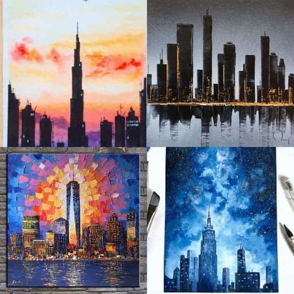
I collected this collage of example pictures of city skyline paintings that I liked for one reason or another.
I made this collage when I posted it for my Instagram audience to help participate in the painting process by asking for any input on which style to try to do.
I almost had to make an executive decision but at the last second I did have a new friend come along to make a suggestion. They nominated trying to emulate the style of the Oil Painting by Enxo Zhou.
So that is part of what we are aiming at here. We’re looking to go for a bit of a textured abstract sort of styled painting.
If you want to take part in the next step by step, follow me on Instagram here!
Doing things like this is one great reason to build an audience on Instagram. Plus, it’s always good to engage with your audience too!
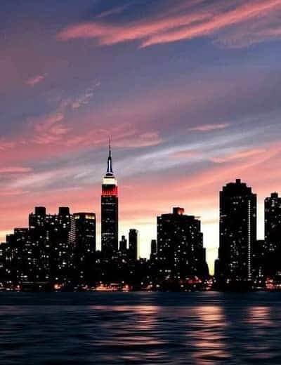
Next, I chose this image of a skyline that I could not find any source for on who the photographer was that took it. It just links to this site called WeHearIt.com with no credit to its origin.
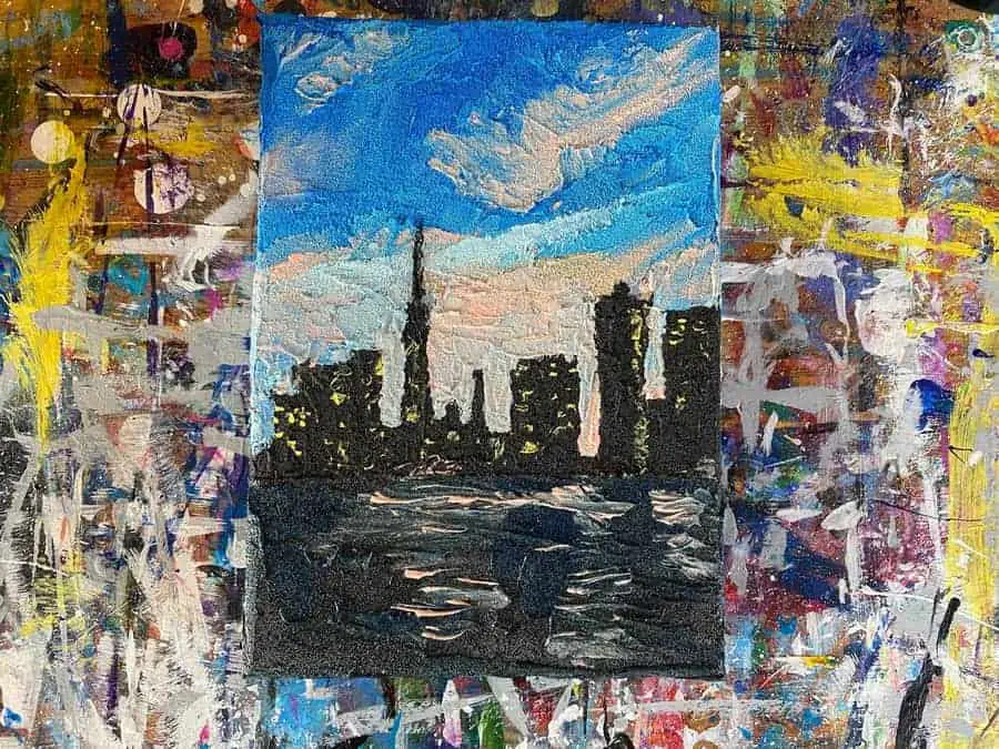
Basically, what we are trying to do is take the style of the painting we chose and apply it to this skyline. We want to mash them together into a textured abstract painting of this group of silhouetted buildings juxtaposed against the blue and pink sky.
Now that we have a good idea of where we want this painting to go all we need to do is gather our supplies and get started painting.
Gather The Supplies You Think You Will Need
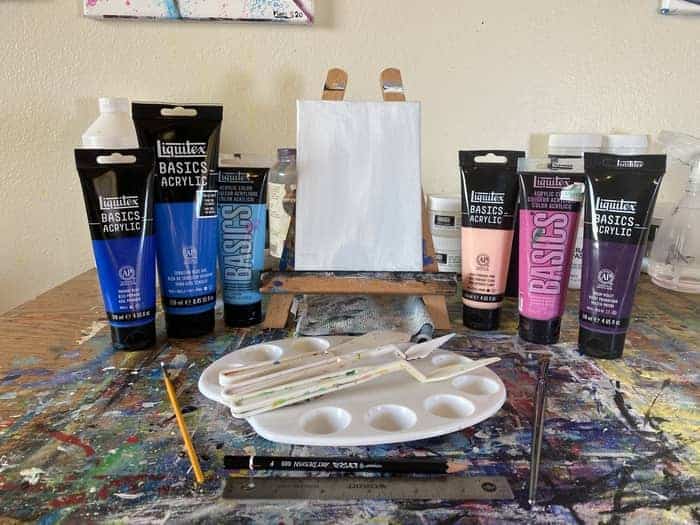
When you go to gather your supplies, ask yourself how you can approach this in the best way that you can get the results you want. Play out in your mind what you are going to do in your painting process to figure out what tools and colors you will need.
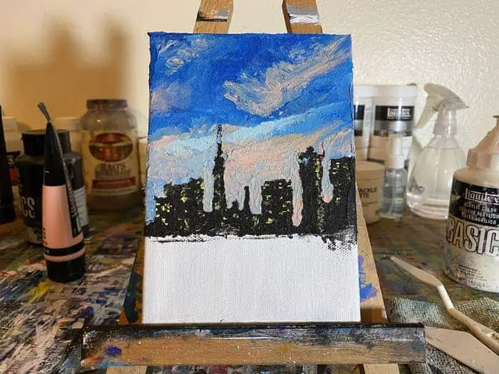
For this painting, I decided to go with a small 5″ x 7″ canvas since this project poses a few additional challenges I’ve never tried before. When trying new techniques I tend to gravitate towards smaller pieces for the easy win.
You of course can work with whatever size canvas you have or prefer but make sure you complete the project once you start it is important to progress. Keeping it small helps with that.
As for the colors you will need, try to get the main colors of the reference pic you are using for the skyline first. Then, looking at our style reference we see the artist took some creative liberties with the colors they choose in their work.
Feel free to throw in some extra colors into the mix that are analogous to the scheme. You may feel inspired to throw others you might have in the works once you get going. Roll with it!
For now here is what I have:
- Primary Blue
- Cerulean Blue Hue
- Light Blue Permanent
- Light Portrait Pink Rose
- Medium Magenta
- Prism Violet
- Ivory Black
- Titanium White
As far as palettes go, I haven’t had one this broad in a while. Somehow I doubt this will be all we need.
While visualizing my process I decided I was going to sketch this one out before we start painting. As I mentioned in the campfire painting, sketching my paintings out isn’t something I normally do.
Funnily enough, this one really called for it in order for me to figure out how to best approach this piece.
So on that note, I have an F drawing pencil and a small ruler to help me draw out a basic skyline.
Then as I was considering what palette knives to use when I began to wonder if I would need paint brushes for anything. Personally, I want to challenge myself to use only a palette knife on this one but you never know.
Maybe we will need some brushes for something. They are more of a just in case sort of thing though.
One last item I didn’t include in the picture above but I ended up using for the whole painting is the Liquitex Ceramic Stucco texture gel. If you’d like to add some of this texture gel to your collection check it out here!
I have to admit at the outset here, my attempt to make this a textured abstract painting may make this project a bit more difficult than something for a complete beginner.
If it wasn’t for the challenges the textures pose then it could easily be a beginner project. If you were looking for something a bit more basic I definitely will need to do another one of these soon without the texture gels.
As I said earlier, there are a lot of different ways to paint any subject, including cities. It just depends on the sort of style you want to achieve.
Draw Out Your City Skyline On Your Canvas
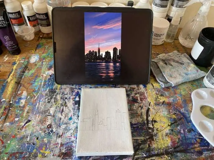
To help us make sure we get something that resembles our skyline here lets go ahead and draw it out on the cavnas.
We basically just want to sketch out some light lines to help guide where our buildings will be going.
We don’t have to add a lot of details as we will be doing that in our painting process.
This is more for proper placement and sizing than anything else. This way we can fill in the sky using our palette knife while leaving plenty of space for the darker colors towards the bottom half of the canvas.
Up until now, I have always just painted everything onto the canvas. This is likely because I started with a lot of abstract works where we are just throwing painting down and then painting over it.
This isn’t the first painting where I have drawn things out on the canvas beforehand but it isn’t something I typically do.
Perhaps as I pursue painting more complicated and foreign things I will need to do this more. Who knows, maybe I find other benefits to doing it that will reinforce me drawing out every painting.
One thing is certain, it always helps to draw sketches of your subject matter BEFORE you are even ready to start your painting or even sketching it out on the canvas.
Building up your visual library of that subject matter will always help.
Now lets see what we can do with this palette knife!
Use Your Palette Knife to Start Painting the Sky
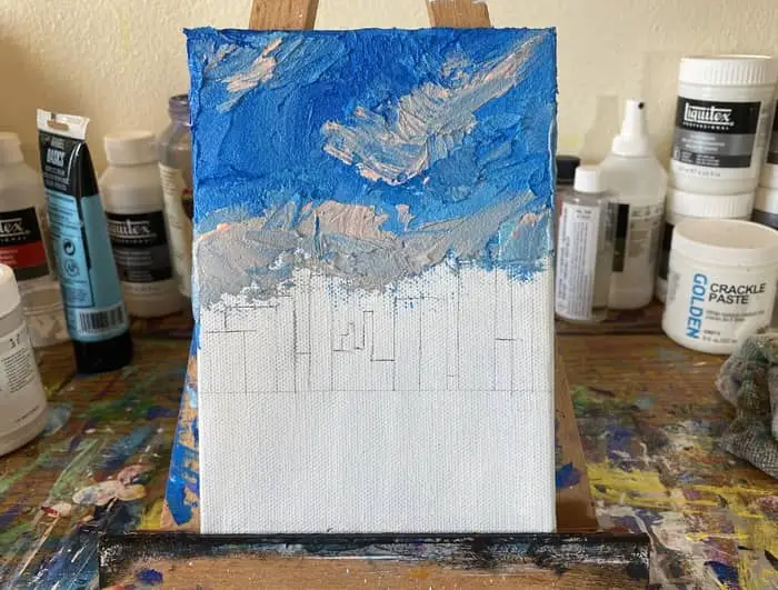
Now that we have our skyline drawn out we can get to the fun part!
Begin working your paint onto the canvas with your palette knife. I’m using a plastic palette knife that has a pointed tip to apply my paint.
Once I started putting the paint down I immediately decided I wanted to use one of the texture pastes that I have. Going with the ceramic stucco paste by Liquitex, we will have to see how this turns out.
I’ve never tried to use my pastes to make an actual image, come to think of it, I rarely make abstract paintings that actually depict something like a landscape or cityscape.
If you happen to like the textures I’m getting in this you can get some Liquitex Ceramic Stucco over at DickBlick by clicking here! There is a lot of other texture gels on that page too!
Now, once I had my paint mixed with the paste I began by working my darkest blue onto the canvas from the top left moving across and down as I went. Adding the lighter shades of blue as we went.
Working with something like the ceramic stucco paste will require you to work quickly and be ready to add colors in while it is still wet. This way you can get the wet on wet blend look we are looking for.
It doesn’t dry right away but it doesn’t stay wet as long as thick acrylic paint will either.
It is going to be more difficult to fix any mistakes while working with the texture gel but we can actually paint on top of it to make minor adjustments.
This is something I actually had to do here. My clouds ended up drying a bit more gray than what I actually wanted so I came in and lightly painted it with the pink rose acrylic paint.
Between working with the ceramic paste and the palette knife, it was a bit intimidating to get the smaller areas of the sky between the buildings.
Plus I didn’t want to paint over my buildings either.
Related Articles:
- Making Abstract Geometric Art For Beginners
- How To Paint a Rose Abstract Style (Easy Step by Step)
- How to Paint A City Skyline (Textured and Abstract Style!)
- 10 Abstract Artists on YouTube to Study and Learn From
- 17 Abstract Artists On Instagram That Will Inspire Your Art
Use Your Palette Knife To Paint The City Skyline
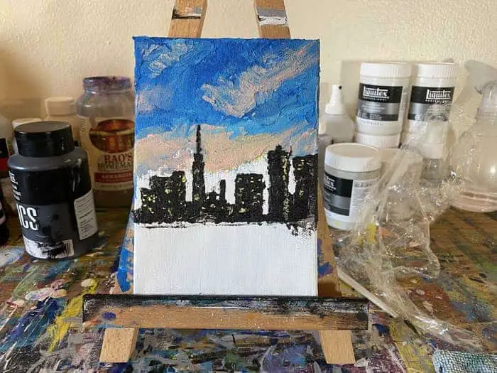
Once we have the sky laid down on the canvas let’s go ahead and add our buildings in next.
We will work on filling in the sky between the buildings after this. I didn’t want to lose my lines I had drawn out for the skyline.
To fill in the buildings was a bit challenging on this small of a canvas with the pointed palette knife.
First I mixed my Ivory Black with the Liquitex Ceramic Stucco paste. I wanted it to be pretty dark so I made sure to mix more paint into it then I did with some of the other mixes.
If you’re following along with just your acrylic paint, since we are going for a bit of a textured look here just be sure to lay it on thick enough. My mix is a bit thicker with the stucco but when I loaded it on my knife I had to be careful about loading just a bit at the tip of the blade.
As long as you keep your paint at the tip of your palette knife you should have a decent amount of control allowing you to stay within the lines.
Since I’m working with the stucco, it may begin to dry a bit more quickly than plain acrylic paint but I would still recommend going in and adding the little dots of yellow light to the building while it is still wet.
I did this right away after making each building.
The yellow was my primary yellow mixed with a bit of titanium white. Which, now that I think of it, wasn’t in the original list of colors.
Do you see now what I’m talking about how other colors find their way into the mix sometimes?!?
Now we just need to fill out our sky more and then work on the surface of the water. Once we do that we will see where the painting is and what else needs to be done to finish it out.
Fill Out the Sky Between The Buildings
At this point in the painting, I’m beginning to question the textured approach. I’m definitely going to want to do another one of these city skylines later in a nontextured style.
For this step, we need to fill in the sky between the buildings. Since this is my first time doing a painting of this sort of style and subject matter, I’m left questioning if there was a better way to do this.
While I like some of the swooping textures in the wide open sky, filling in the smaller parts between the buildings left much smaller texture details that aren’t as cool looking as the textures in the open sky.
The other challenge here is getting the colors right so they mesh with the sky above the buildings.
While we begin to stray from the colors depicted in the main skyline reference, it is a necessary evil to get the blend anywhere close to looking like it belongs.
You have to be careful to mix your colors right so it doesn’t look like there is this blob of different colored material between the buildings and the open sky.
In my example, I wanted to try and make the sky brighter as that is how the gradient goes in the picture but a light blue mixed with the pink rose paint was the best way to get a color that actually went with what I have on the canvas already.
To apply it, we need to again work very carefully by loading the paint at the very tip of our pointed palette knife. I likely will need to come back in with some more black to touch up some of the buildings where I messed up.
This is the main reason I wonder if there was some better way to approach this. I guess it will take us doing more projects like this to work it out though!
Let’s go ahead and move on to our water and after that, we will see what else we can do to make this painting just a little bit better.
Add The Water and Surface Reflections
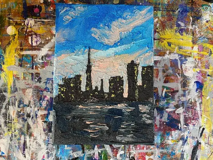
Now we finally get to the surface of the water.
Since the surface of the water is almost as dark as the buildings I mixed my stucco with black paint and then a tiny bit of a primary blue. I think it still came out a bit too black though.
If you’re not using stucco you may want to consider some other colors than what I have chosen.
For this part, since we are working with an area of canvas that is going to all be the surface of the water get your base color down.
Spreading it out is sort of like spreading icing on a cake.
After working with the stucco for this whole painting, it’s now apparent it has a relatively quick drying time. Not so fast that it is a huge problem but fast enough to be a bit of concern if you want to add additional colors to it while it is still wet.
Which of course we do want to try to do that. It’s easier to get the watery reflective effect if we add the pink rose reflections while it is still wet.
Once I had the darker water background down, I applied the pink rose paint directly onto the water surface with the straight edge of the palette knife.
You can mix it around on the canvas a bit to get some of the softer reflective effects but you still want to leave some of the stronger streaks. Add them in once you have the softer reflective parts mixed.
This sort of style is supposed to be a bit messy so don’t worry too much about getting it perfect. Getting a textured result like this sort of causes a bit of messiness. Especially when it’s your first time trying it!
We can potentially try to touch it up with some paint once it dries if we need to but it’s better to get it how you want it while it is still wet.
If you’re using only acrylic paints you will want to wait until it completely dries before you come back and do anything else to it. It will take longer to dry than the stucco mixture.
You can always use a hair dryer to speed up the process too if you need to.
This city skyline painting turned out a bit different than how I initially imagined it would but I certainly learned a lot from the attempt.
The style I ended up with is quite a bit different than the style reference we selected at the beginning.
The choice to use the stucco caused unexpected challenges and a different sort of textured look. I think I’m happy with it though.
