As an abstract painter, I can’t help but be curious about making paintings with certain materials and tools.
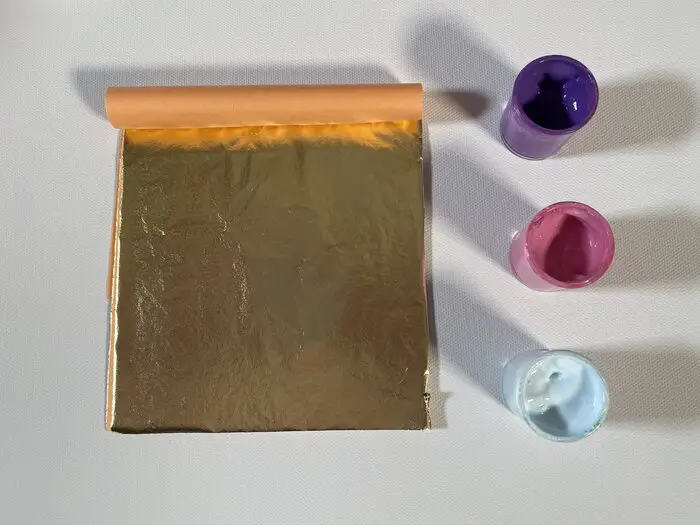
One material I have wanted to use for some time now is Gold Leaf. Recently, I was finally able to acquire some gold leaf and make a few paintings with it.
To use gold leaf in your painting all you need to do is apply it to wet paint where you want it to go! After the paint dries you can then take a dry brush with stiff bristles to brush away any pieces of leaf that didn’t stick.
So far I’ve conducted two experiments with gold leaf in my paintings. I was lucky that my first attempt worked out nicely. I made a YouTube shorts for that one that you can check out here!
My second attempt I’m not nearly as satisfied with. For this one, I made a regular YouTube video that you can check out here! To me it feels messy. Something just feels off about it.
We can’t be afraid to make mistakes! We have to plow through them and keep it moving. There are a few things I learned along the way so let’s dive into it and make a third attempt!
The Materials Needed for This Project
Before we jump into the mix lets discuss some of the materials used in this painting.
First and foremost, the most important thing is the gold leaf.
In this example, I’m using the Old World Art Leafing Kits that you can find here over at DickBlick!
That’s really the most important piece for this project that if you don’t have you absolutely need to get.
You can make an abstract painting with gold leaf if you don’t have any! This of course goes without saying but I said it anyway!
The next thing you might need, which is totally optional, are acrylic paint pens. In this particular painting, I’m using the Posca Paint Pens.
You can find those over at DickBlick too by clicking here!
These are very popular around the web and many artists speak highly of them. I think they’re pretty great too I just haven’t used acrylic paint pens a whole lot.
While I currently have 3 different sets of acrylic paint pens my experience with them is too limited to be able to compare adequately.
As for the rest of the colors and acrylic paints you will need I go over them in more detail in the following sections.
As long as you have the rest of the basic materials like canvas and acrylic paints you should be good to go.
Choosing A Good Color Scheme
For the first painting I did with gold leaf I worked a bit more intuitively and just went with the colors that I “felt” were right. This is certainly one way to approach it if you have a good feel for colors and color harmonies.
It’s definitely a good way to exercise your understanding of color harmonies. (more on harmonies in a moment)
For the second painting, I went over in the YouTube video a cool tool you can use to generate color schemes to try.
Coolors.co is a website you can use to randomly generate a color palette that works if you’re not quite sure what colors to use. Just manually enter in the code FFD700 for gold and lock it in.
Then hit the spacebar to get colors that will go with your gold leaf. I don’t think this is the exact code I originally used in my YouTube video where I go over this but it should suffice for finding colors that work.
Funnily enough, while I was writing this I hopped over to it and entered in that code for gold then hit the spacebar and it gave me a color that I already knew I wanted to use. Just yesterday I saw a gold and black t-shirt and had the passing thought, “hmm…gold and black would make for a good gold leaf painting.”
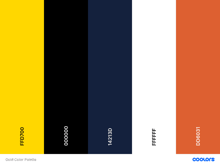
This is what it generated for me.
I swear, sometimes the universe is in a perfect alignment with my desires serving me the exact things I need when I need them. I found this particular color palette perfect for this project.
It jived with my vibe mannn….
Up until I started writing about Coolors just to tell you about it here I hadn’t planned to use it for this project but that first palette it generated works for me!
I do however recommend that you gain some level of understanding with color harmonies. They are very useful to know as an abstract artist.
Once again, I now have a video for that! If you prefer to take on the challenge of creating your own color palette for this project check out this video and take on the “Color Harmony Abstract Challenge”!
If you do take the challenge I would love to see your work! You can find me on Instagram here! It’s also a great place to see what is currently going on in the Art With Marc Studio!
It’s usually the first stop on my content production pipeline. You can just tag my username or use the hashtag #ArtWithMarc for any work you want to share with me.
Color harmonies are the lowest hanging fruit for any abstract artist to understand and master. Take the challenge and you will certainly level up your understanding of them!
As always, I invite you to use the same palette as me and follow along or you’re welcome to generate your own palette as well!
Start By Painting Your Background Dark Blue!
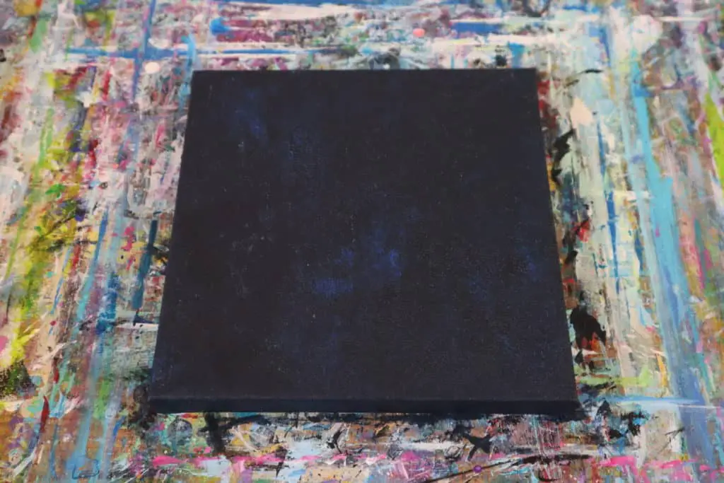
I very often start by painting the canvas black and decided it was time to switch it up a bit. I think this is a remnant of being influenced by John Beckly very early on.
I’m currently trying to diversify my sources of influences so that my results come out in a more original way.
For this project, we want to start by painting our canvas the dark blue color. If you’re using your own palette feel free to use one of your darker colors for this step.
I feel like I didn’t quite get the shade of blue that we see in the color palette above. If you ever have trouble getting a particular color mixture I have an excellent resource for you to refer to!
An artist friend of mine and fellow content creator, Chris Brier, has been building an excellent series of videos on how to mix pretty much any shade of color you may be having trouble with.
They are short shots of color mixing knowledge that you can swallow up in 60 seconds or less. Here is the video I should have watched before trying to make that color blue my background.
For more awesome color mixing videos check out Chris’s YouTube channel here!
I was way off on the colors I needed to mix together! (psst…for the record, I mixed together cobalt blue hue and ivory black..doh!)
See that? We’re both learning here!
I will have to try and get that shade of blue into the painting in one of the next steps.
For now though you can at least learn from my mistake and have the colors in the above video to mix the blue we actually need for this particular color palette.
Oftentimes, abstract painting can be very whimsical. There can be a lot of trial and error involved until you land on an arrangement that works.
While it is good to plan your paintings in order to get better results it can be a lot more freeing to just start working and see what emerges. If you take this route it’s good to know about the principles of art to help guide your decisions.
Check out this page here to learn how about the various principles of art!
After I had used my palette knife to apply the first layer of paint I decided I didn’t want the textured palette knife look and lightly dabbed it out with a sponge. Creating the sort of texture you get from sponges.
Related Articles:
- What Makes a Good Abstract Painting? The Principles of Art
- Acrylic Paint Pens and Markers
- Making Abstract Geometric Art for Beginners
- How to Paint a Rose Abstract Style
- How to Paint a City Skyline (Textured and Abstract Style!)
Draw In Lines Using Orange Acrylic Paint Pen
You can do this next step using tape, an acrylic paint marker, or even a bit of both like what I did.
Since I neglected to get a picture of this step I decided to put the YouTube Short that I made for this painting above. This step starts at about 8 seconds in where you see me using the ruler and an acrylic paint marker to make some orange lines.
I didn’t start it at that 8 second mark because I was trying an experiment in this short where I’m attempting to inspire the viewer by expounding upon my thoughts on creativity. I felt you may enjoy hearing it and checking it out if you haven’t already.
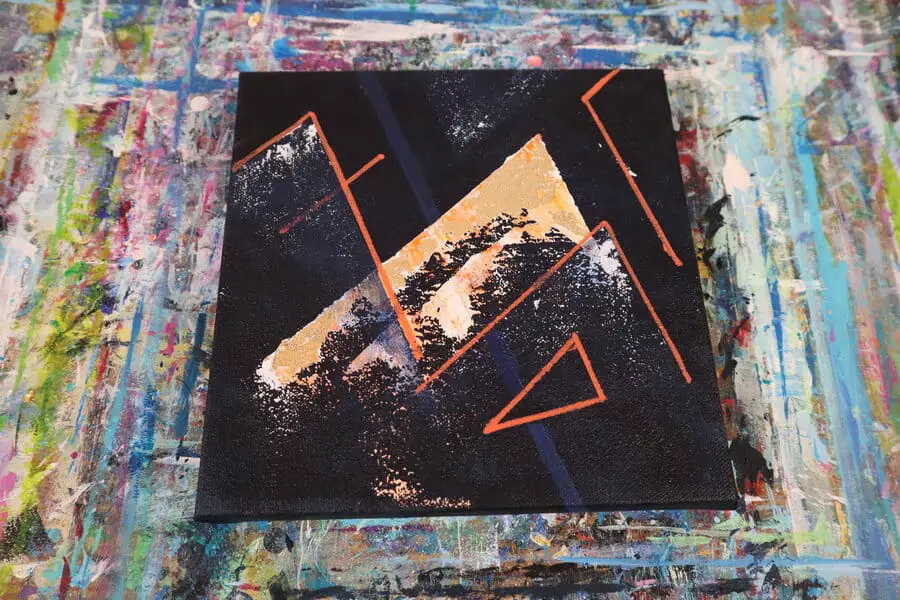
That said, in this step you want to lay out some lines and shapes. I have a particular attraction to angles and triangles for some unexplainable reason and naturally that is what I found myself throwing into the mix.
You are more than welcome to follow along with what you see me doing, especially if this is your first attempt at using gold leaf and you just want to get to that part.
However, if you’re working with your own palette or seeking to develop your skills so you can work intuitively I highly recommend learning about “The Principles of Art” by clicking here!
When I’m working intuitively, like I did with this particular project, I very often think about these principles as well as some of the principles of good layout. Often times, when I find something doesn’t “feel right” it is usually because one of the principles of art is off in some way.
We will discuss this more in a bit as later on in the painting it reaches a point where it still didn’t “feel complete” to me.
Once you have some lines laid out on the canvas let’s move on to the next step!
Add Your Gold Leaf to Wet Paint
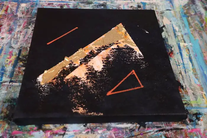
Now that we have some idea of the shapes we might want in our painting next we need to start adding some paint in.
In this case, I immediately didn’t like the hand drawn version of my main shape so I decided to tape it off and add my paint there.
Using Vivid Red Orange and Titanium White I applied the paint with a palette knife.
Once you have your paint on the canvas where you want it the next thing we need to do is put our gold leaf onto the wet paint where we want it to go.
For this step, you want to be careful to very lightly pick up the gold leaf if you’re going to be using your bare hands. The leaf is so thin that it will get stuck to the oil on your finger tips if you pinch it too hard when picking it up.
You can use various tools for this step as well. One that I like to use when I’m trying to avoid this, especially with small pieces of leaf, is a stiff-bristled dry brush. The gold leaf usually will be picked up with a good push into the bristles.
Once your paint dries go ahead and remove your tape.
Now that the paint is dry, take your stiff-bristled dry brush and use it to scrape off all the parts of the gold leaf that didn’t stick to the paint.
Next Add Additional Shapes In Blue and White
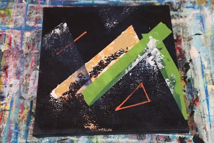
In this step we’re going to follow Chris Brier’s color mixing video that I posted in the previous section to get the correct shade of blue.
I actually didn’t have the exact same colors he uses in the video on hand so I went with Ultramarine Blue, Naphtol Crimson, Primary Yellow, and Titanium white. I found these colors good enough to get close to what Chris is demonstrating in the video.
The color bias on these colors must be similar to the ones he uses since I got pretty close to the results he got. It’s actually hard to tell in this step by the picture above because my background came out so dark it might as well be black.
So when the new blue mixture dried some of that darkness in the background is making it darker then it would be if I applied several layers of it. One layer is still a bit transparent.
As you can see in the picture above, for this part I started by taping off sections where I thought the painting needed something. By using a similar shape and angle I’m helping to create balance and rhythm within the painting. (Some of the Principles of Art).
Using your paintbrush, lightly paint a layer of blue into the areas you have taped off.
Then take a palette knife put a very light amount of titanium white on it. Due to the texture left in the first step by the sponge, if you take your palette knife and lightly scrape it on the surface of the canvas it should only leave white paint on the peaks of those little textures in the paint.
This will give you that broken static look that you see me getting.
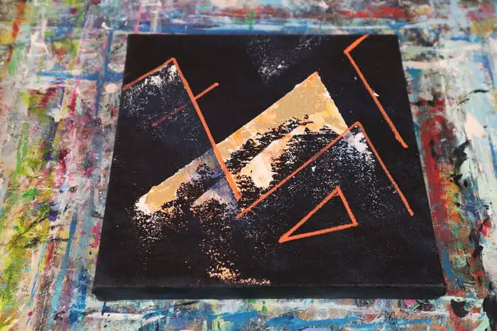
Highlight Your Shapes With an Orange Acrylic Pen
This step is pretty simple.
Since the layer of blue paint on the shapes dries so transparent I wanted to highlight and define their shape a bit further.
I used a Posca Acrylic Paint Pen for this step and basically just outlined the shapes I wanted to stand out more.
I left the top blue triangle to sit up at the top on its own and added in a couple of extra orange lines to fill the space in the top right of the painting.
This step could be optional depending on if you are following me along exactly step by step or you are using what I’m showing you here to do your own thing.
Personally, I needed those shapes to pop a bit more. Plus, adding the orange line on the left side of the painting that crosses over where our gold leafing is helps to draw the eye around the painting.
Leading right into a focal point and into another orange line that brings the viewers eyes back up in the other direction.
Engraining such considerations into your thought processes will definitely help ensure that your final product is something people can’t help but stare at.
Bring A Sense of Closure To Your Painting With Proper Balance

By the time I got to this step in the painting I was feeling really uncertain about the results.
Something just felt off.
If you come to a point like this in one of your paintings where you’re not following a step by step and are working more intuitively I recommend taking some time just to look at it. Ask yourself what is it about this painting that is giving you the feeling of it being off.
For me, when I reached this point I was very tempted to paint over the entire thing and start over. Fortunately for me, I’m putting a lot of pressure on myself to keep things moving forward on this website and on my YouTube channel. (Which you can check out here!)
That pressure often leads me to drive forward on a project despite the uncertainty I might be feeling with it. This is important to note as this is an experience you will frequently have with a painting.
There are many many times when I’m working on a painting where I feel like all is lost. I’m terribly dissatisfied with where its at but I continue forward despite that.
Most of the time this is because I know that this happens almost every single painting I do and that when I press forward I’m able to bring it to a place of completion I’m happy with.
In this particular case it was because my production schedule requires it.
After spending some time staring at the painting trying to discern what it was that felt off it was clear to me that this big open space down the center diagonal was what needed some attention.
So I decided to add a blue stripe to the background.
It was really surprising to me the feeling of resolve this blue line brought into the painting.
I can’t quite explain it other than it was like the painting was the end of a song that wasn’t quite complete yet. Almost as if it ended on the wrong note of a scale to feel complete.
It was just one note shy of coming back to the base of the scale that makes the measure feel resolved.
Adding this one line in was like adding in that final note to a measure that makes it sound complete. Whether you’re familiar with musical scales or not makes no difference.
You instinctively can tell by listening to it that it was missing a note and wasn’t complete.
To me, listening to these feelings and finding their associated principle of art can go along way towards improving your skills as an artist. Especially as an abstract artist where we often aren’t working with any particular subject or even a specific outcome in mind.
